
15 BEST Landscaping Website Designs [Steal Their High-Converting Features]

You take great pride in your work as a landscaper because you know every blade of grass is sending a message to potential customers.
Why treat your website any differently?
Unfortunately, many landscaping sites send the wrong message. Whether they were made a decade ago or built by someone who didn’t understand your business, the end result is the same – a bland, digital business card that doesn’t build trust or inspire anyone to contact you.
We’ve rounded up 15 of the BEST design features to make sure your site’s message is hitting all the right notes.
One look at a completed landscaping project in your portfolio should tell people everything they need to know about your quality.
Even hedges. Brilliantly colored flowers. An eye-catching water feature. All visible from a new timber patio that’s the star of the show. With these features your work practically speaks for itself.
Your landscaping website design is sending a message to potential customers too.
What message is your site sending?
A professional landscaping website design that showcases your expertise, credibility and skills is crucial to help you build the trust that comes before a sale. Whether you’re building new garden paths, or transforming a 20,000 square foot yard, no one hires you until they trust you.
To help your website stand out (for the right reasons) we’ve rounded up the 15 BEST landscape website design features. These features will help you rank on Google, generate more leads, close more sales, and make more money.
Oh, and we’re not showing you these just to pass the time. You should be STEALING these design features and using them to grow your own business.
Ready to transform your website? Let’s get started.
Why landscape website design matters?
Your business is more than your landscaping services.
Everywhere people come in contact with your brand, that experience becomes an extension of your company. If that experience is positive, people think of your business with positive feelings. And if those experiences are negative, well, your business suffers.
If your website was made in the late 90’s, doesn’t load on a customer’s iPhone, and constantly crashes, then people will connect the poor quality of your site with the quality of your business.
Even if you can spot a daisy from a daffodil at 500 yards, a low-quality website makes you look like a low-quality landscaper. That’s why a single bad website experience makes customers 88% less likely to ever come back.
So you’re absolutely right, your customers 100% care about great yards.
But they’ll use your website to judge whether you’re capable of providing the great landscaping experience they’re looking for.
Read on to discover the 15 BEST landscaping website designs, plus why they’re so effective and how you can use them on your site.
Top Landscaping Website Designs To Watch out For
#1 – Lawn Doctor
High-Converting Feature: ‘Free Quote’ Form Above The Fold
Your website is like a backyard – meaning certain areas are more valuable than others.
For example, the backyard center offers better landscaping value than the small corner behind the shed. That’s why water features tend to end up in prime visibility spots, or garden paths built where foot traffic is most common.
For a landscaping site, the real estate at the top of your page – known as the ‘above the fold’ portion of your web page – is some of your most valuable digital real estate.
Anyone landing on your site doesn’t need to scroll to see what’s above the fold. They get your content served straight to their eyeballs. Unfortunately, it’s common for landscapers to add a video or striking image to this precious space and assume people will scroll down.
Newsflash: People are lazy.
The average person spends less than 15 seconds on a website before leaving.
You need to convince them to take action quickly – and placing a ‘Request a Quote’ form above the fold helps you catch their attention before they leave.
If your goal is to secure a quote request or lawn care consultation, use your above the fold real estate to offer this to site visitors. This is what the team at Lawn Doctor have done and they’re more likely to get lawn evaluation requests from customers who didn’t want to browse a whole site – they just wanted to leave their name and number and schedule a call-out.
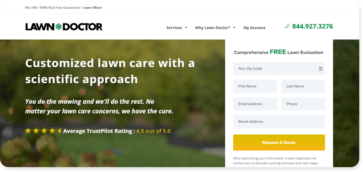
WHY WE LOVE IT: We’re huge fans of the website design elements on show here. From the inclusion of their average rating on TrustPilot to the bold, white font which stands out thanks to a slight blurring of their background image, every decision is strategic. Check out how the word ‘FREE’ jumps from the page, and with a bright yellow CTA button it’s impossible to avoid their offer of a free lawn evaluation.
#2 – Brizscapes
High-Converting Feature: Trust Badges
The #1 most valuable trait your landscaping site can possess is trust.
When customers trust you, they’re more likely to hire you. And if they’re 1% worried you’ll let them down, they’ll go looking for a new landscaper. Even if the price is right, without trust you’ll lose customers.
As a Tradie Digital-built website, we helped the team at Brizscapes use this to their advantage by adding 5 trust badges in the form of their ‘Landscape Queensland’ awards. In 2018, 2019 and 2020 the Brizscapes team was recognized for their excellence. By showing off these awards they make potential customers feel at ease.
If you’re choosing between two landscapers, and one of them has been awarded year after year, who are you going to choose?
More than a tool to attract new clients, trust helps you generate more money from current clients. When people trust you they become repeat customers, contacting you for everything from a new garden path to backyard maintenance and the new deck they’ve been planning.
With studies showing an increase in trust can boost lifetime profit per customer by 85%, adding your own trust badges is a simple way to stand out in a crowded market.
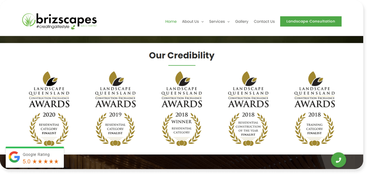
WHY WE LOVE IT: What stands out on our Tradie Digital-built Brizscapes website is the design of these trust badges. The iconography conveys a sense of premium quality, which site visitors connect with Brizscapes. The landscapers at Brizscapes have also added a floating ‘Google Rating’ pop-up which follows a user as they scroll. The combination of trust badges and those glowing, 5-star reviews makes it easy to book a consultation.
#3 – Vic Turf & Landscape Solutions
High-Converting Feature: ‘Why Choose Us’ box
Every landscaping customer is asking the same question the second they land on your site – “why should I choose you?”
A ‘Why Choose Us’ box answers that question from every possible angle.
The landscapers at Vic Turf & Landscaping use this design feature to their advantage to answer six possible questions their customers may have. Without ever speaking to a site visitor, this landscape design feature answers the questions:
- “Are you qualified turf specialists or just outdoor enthusiasts?”
- “Are you insured if something goes wrong during my project?”
- “I’m short on money, do you offer payment options to help me out?”
- “I’m not home during the day, can you pop by and do the job while I’m away?”
- “Hmmm I’m on the fence. Can I have a free chat about the project before I decide?”
- “Are there any testimonials or references from past clients I can see before we talk business?”
In one box, six questions have been answered and a new customer is a step closer. Even better, ‘Why Choose Us’ boxes help reduce the number of phone calls and emails you receive that waste your time.
If you get 10 calls a month asking if you’re a licensed turf specialist, that’s hours wasted answering the same question over and over. By answering this question on your site, you get to spend those hours elsewhere.
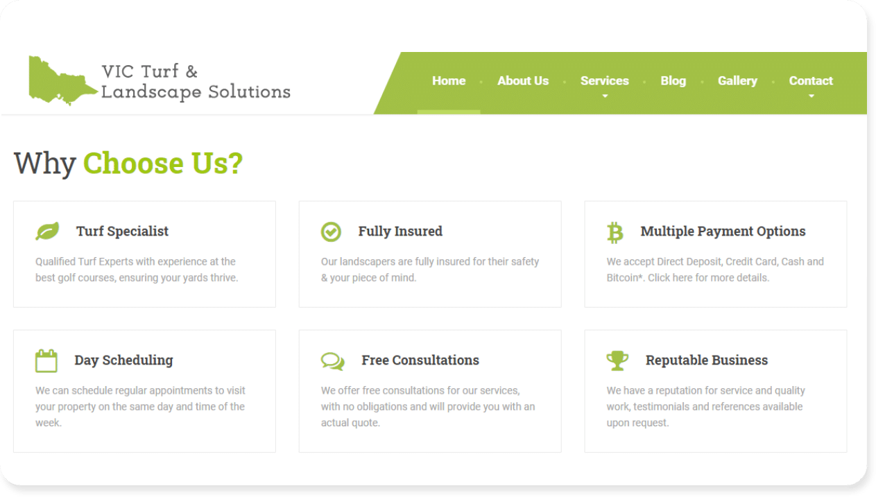
WHY WE LOVE IT: Outside of being a time-saver, it’s the design here that we love. The entire website shows consistent branding with the same shade of green used strategically to draw the eye. In case you’re wondering, it’s no coincidence that the words’ Choose’ and ‘Us’ are highlighted in green. When the eye skims down the page, a site visitor’s brain focuses on the bold, green text. And the subliminal message? CHOOSE US.
#4 – Ryan Lawn
High-Converting Feature: Location Pages
As a landscaper you want your site to impress potential customers, but you also need to impress Google.
Google wants to show the most relevant results to users. So if someone searches for lawn care help in Kansas, Google will show businesses from Kansas. If the search comes from Oklahoma, Google will show businesses from Oklahoma, etc.
To help boost their chances of ranking in specific suburbs, the Ryan Lawn team have created individual location pages and linked to them from their home page. In addition, they’ve added their service areas to a striking map with bright green markers to show where they work.
By clicking on the individual location pages (visible in red font below) a potential customer can browse services close to home. Even better, Google can see that Ryan Leaf offers lawn care in multiple locations (Kansas, Missouri and Oklahoma) which boosts their chances of ranking in each state.
- ‘Lawn care service in Kansas’
- ‘How much to clean my backyard Oklahoma’
- ‘Missouri fast lawn care help’
Customers searching for these types of keywords can find Ryan Leaf because they’ve built individual location pages to help them appear when people go looking for help in their own backyard.
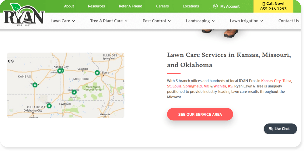
WHY WE LOVE IT: Landscaping website design is more than using the right colors or professional images. By adding a map and location pages, Ryan Leaf has boosted their SEO and made it more likely to appear in Kansas City, Tulsa, St. Louis, Springfield and Wichita. They didn’t need to create 5 different websites. With a map and location pages connected by internal links, one site can bring customers from 5 cities.
#5 – D&V Turf Supplies
High-Converting Feature: Multiple Call-To-Action (CTA)
You weren’t born yesterday. You know your website needs call-to-action (CTA) buttons to tell people what to do. Still, 70% of businesses lack a CTA anywhere on their homepage!!!
If you’re using a CTA, pat yourself on the back.
But if you’re using just one CTA, you might still be leaving customers on the table.
Using Pedestal – the website builder created for landscapers – D&V Turf Supplies uses two CTA buttons to excellent effect to funnel site visitors towards a goal. This works because it gives people two options – and one is significantly easier to claim than the other.
In this case, a potential customer can arrange for the D&V Turf Supplies team to come to their property and provide a free lawn consultation. This is worth $95, but it involves being home. This might be a hassle for someone who has to stay home at the right time, and get out of their pajamas to meet the lawn care expert. They might even be hit with a hard sell (which no one wants).
In contrast, that same potential customer can request a free quote. No need to organize a home visit (and they can stay in their pajamas to chat on the phone). It’s quicker, easier, and the simpler option.
This is BRILLIANT landscape website design – that comes pre-built into Pedestal templates. – because it leads more potential customers to reach out and request a quote. Compare this to landscaping sites with a single CTA to ‘Request a Quote’. On its own, requesting a quote is still a commitment of a phone call and 30+ minutes of a potential customer’s time.
But when offered next to an on-site lawn consultation, the ‘Free Quote’ option becomes instantly more attractive and easier to click on.
Rounding out the brilliance of this design feature, if a lead requests the free lawn consultation, the team at D&V Turf Supplies can score their hot leads and market to them accordingly.
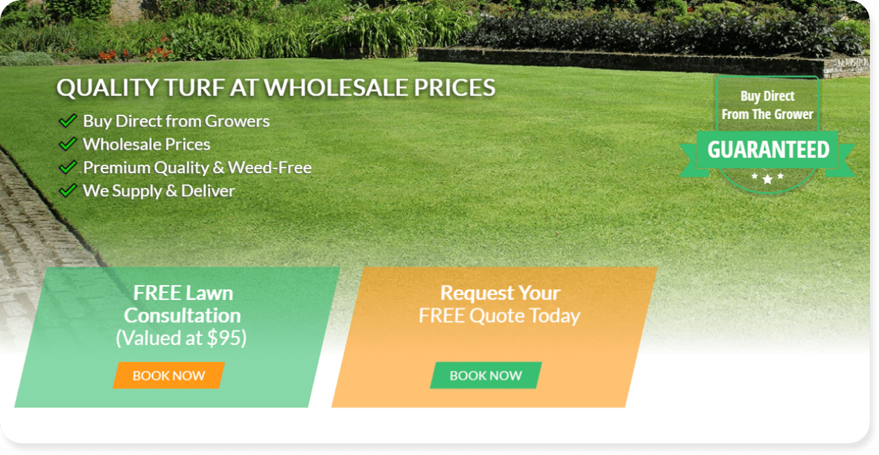
WHY WE LOVE IT: Most purchasing decisions aren’t made logically, but with emotion. People need to “feel” before they decide on a course of action. This dual-CTA approach makes people feel like they’ve got two options and one feels like the stress-free option – making it easier to click and driving more quote requests.
#6 – Texas Terrain
High-Converting Feature: Pop-Up ‘Request a Quote’ Form
A website pop-up helps you grab attention and promote your free estimate or lawn evaluation without distractions.
Your website is a hub of activity and info, as it should be. When someone lands on your homepage you want them to be able to read about your lawn care services, jump to your latest blogs, or browse your best backyards in a gallery.
But the more options people have, the less likely they are to take action.
Studies have shown that more choices on your website leads to a WORSE experience. To simplify the process of contacting a landscaper, the team at Texas Terrain have implemented their own pop-up to give people just two choices:
- Schedule a call about your landscaping project
- Send a message about your landscaping project
This limits a potential customer’s options and makes it easier to take action. If they’re keen to chat about the project they can schedule a call. If they’d rather send an email, that becomes a more painless option.
It’s easy to think “oh, a pop-up will annoy my potential customers”, but the opposite is true. Remember, someone has clicked on your site because they’re interested in hiring a landscaper.
Your pop-up helps them direct interest into an action.
Interestingly, data shows the average click-through-rate for email is around 2.61%. And the average click-through-rate for pop-ups? 3.09%. Meaning you’re more likely to get clicks with a custom pop-up than sending emails to your contacts.
The takeaway? Do as Texas Terrain does and make it easy for people to take action.
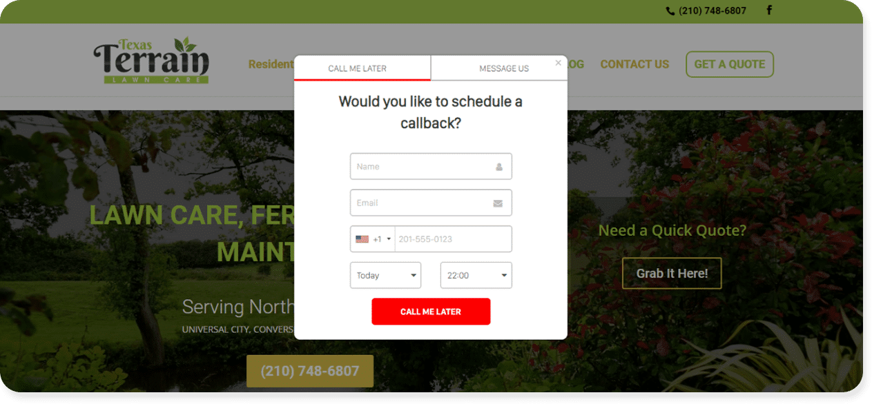
WHY WE LOVE IT: The color red practically jumps off the page in the pop-up above. This makes it easy to see, and even easier to click. We’re also big fans of how the Texas Terrain team has the contact time set to today. The less boxes a prospect needs to fill, the easier it is for them to organize a call-back.
#7 – Landscape By Design
High-Converting Feature: Landscaping Project Galleries
The best landscaping website designs show, they don’t tell.
Nothing helps land a new customer like showing them *exactly* what their finished outdoor space will look like, because landscaping customers want to spend their free time outdoors, in a space that’s their own private oasis.
No pressure, but they expect YOU to be able to build that oasis for them.
To help show them what a working relationship with you will look like, consider adding a project gallery to show off your previous work. This will help remove the friction between sales and is a classic landscaping design for good reason – because it helps bring on new customers.
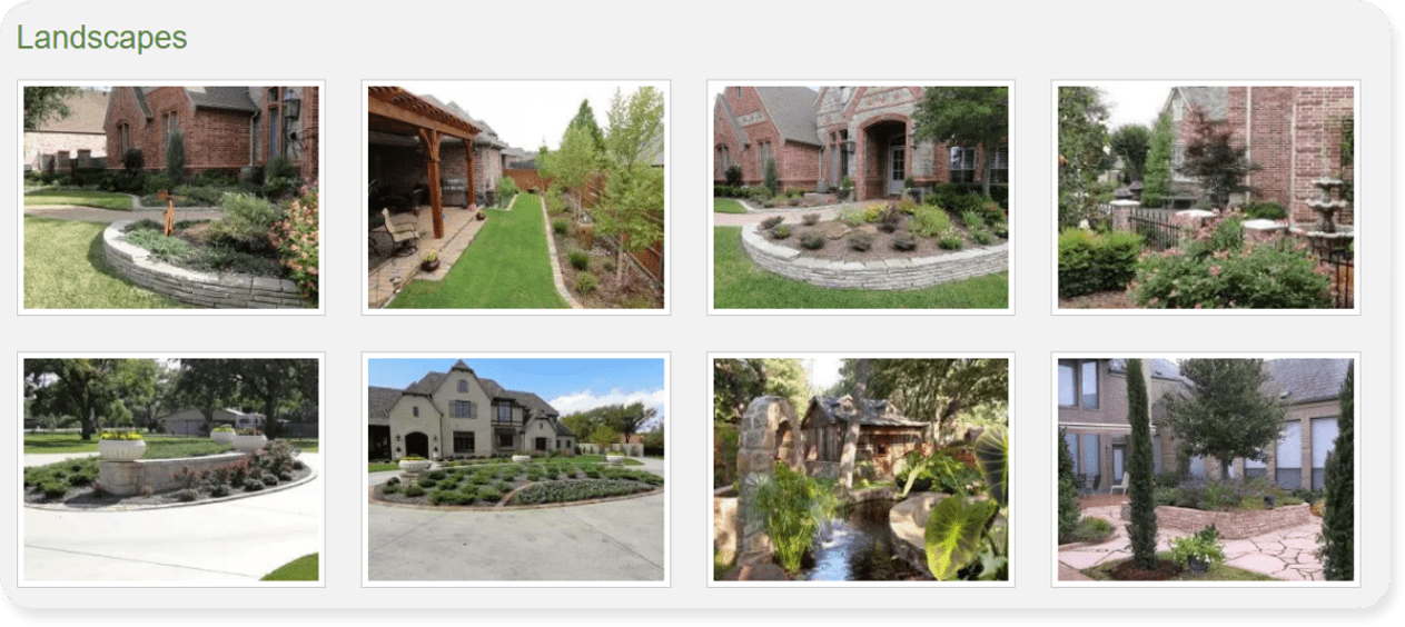
WHY WE LOVE IT: The Landscape By Design team has 50+ high-quality images of their latest projects. By using quality photos they paint a vivid picture for potential customers. Multiple angles mean site visitors can look into the crystal ball and say “wow, I want my yard to look like this”. It’s ‘show, don’t tell’ in simple, highly effective terms.
#8 – Just Right Lawns
High-Converting Feature: Deals & Promotions
The best landscaping sites find ways to offer more value than their competition.
If everyone mows lawns, then just advertising a lawn mowing service on your site isn’t going to turn heads. The landscapers at Just Right Lawns stand out from the crowd by adding limited-time offers, promotions and coupons to entice people to reach out.
Instead of just offering free lawn care quotes and estimates (which 99% of landscapers provide), they also include a large, easy to find value proposition in the form of a ‘Memorial Day Special.
Customers can claim $21 off their first mow, which promises quick and easy savings.
The Just Right Lawns team also uses design to their advantage by mimicking coupons you’d see in a magazine or newspaper. The dotted edge inspires feelings of cutting coupons and taps into the site visitor’s previous use of coupons and getting great value.
It’s a simple design tweak that helps drive more conversions.
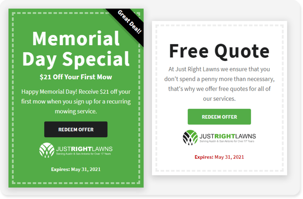
WHY WE LOVE IT: The contrast between green and white makes each coupon easy to read on the Just Right Lawns homepage. Anyone scanning this page is drawn to these eye-catching features, with the added ‘Great Deal!’ banner telling people exactly what they’ve got in store.
#9 – Landscape Services Inc.
High-Converting Feature: Guarantees
Your landscaping customers want a premium service, but they have no way of knowing you’ll provide one.
Even with 100 gold-star reviews and a professional landscaping site, hiring a landscaper comes with certain risks.
What if the new plants aren’t suited to the climate? What if the timber patio warps? What if the water feature sends my water bill through the roof?
That’s why you can boost your chances of a lead and sale by offering guarantees – which Landscape Services Inc. do perfectly. They understand that customers have reservations about hiring a landscaper and tackle them with a ‘We’ll do as We Say, or You Don’t Pay’ guarantee.
This gives the LSI team an advantage over landscapers offering the EXACT same service. Instead of uncertainty, their customers can look into their crystal balls and see a win-win outcome.
They either get the dream outdoor space they craved. Or, they get the entire project done over at no extra charge. Feeling safe in either outcome, they’re more likely to become a lead and then a customer.
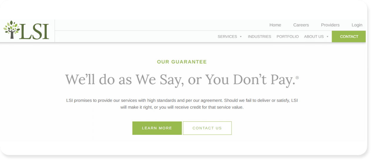
WHY WE LOVE IT: Guarantees provide a safety net for landscaping customers, and we love the way this guarantee builds trust. As marketers, we also love the copy. A rhyme like ‘We’ll do as We Say, or You Don’t Pay’ is easy to remember and sticks in the head. This helps customers think of the LSI team and that brand recognition leads to more sales.
#10 – Purple Care
High-Converting Feature: Landscaping Blog
Landscaping customers don’t wake up and think “I’ll contact a landscaper today”.
The journey to picking up the phone or sending an email is a long one. This process can take days, weeks, or even months. This is called a ‘Buyer’s Journey’ and it is made up of three stages:
- Awareness: The customer becomes aware they have a problem
- Consideration: The customer considers possible options to solve the problem
- Decision: The customer decides on a solution to the problem
Here’s how that might look for someone wanting to build an alfresco entertainment area.
- Awareness: “I LOVE hosting friends outside but I have nowhere to BBQ outdoors”
- Consideration: “I could try and DIY a patio, or hire a landscaper to build one for me”
- Decision: “I’m choosing ‘David’s Landscaping Co’ because they’re affordable and fast”
What does all this have to do with a blog? Well, your blog nurtures people and guides them through each stage of their Buyer’s Journey.
Remember, no one wakes up and spends $15,000 on a new patio. They become aware of the problem (nowhere to entertain outdoors). Then consider their options (by reading blogs and articles).
It’s a mistake to think a blog is a waste of time because it’s not closing sales. A great landscaping blog is helping you land sales by giving people the info they need during the ‘Consideration’ phase, which helps you land the deal during the ‘Decision’ phase.
The team at Purple Care have shown this perfectly with a blog that’s easy to find, and blog content that helps people through each stage of the ‘Buyer’s Journey’.
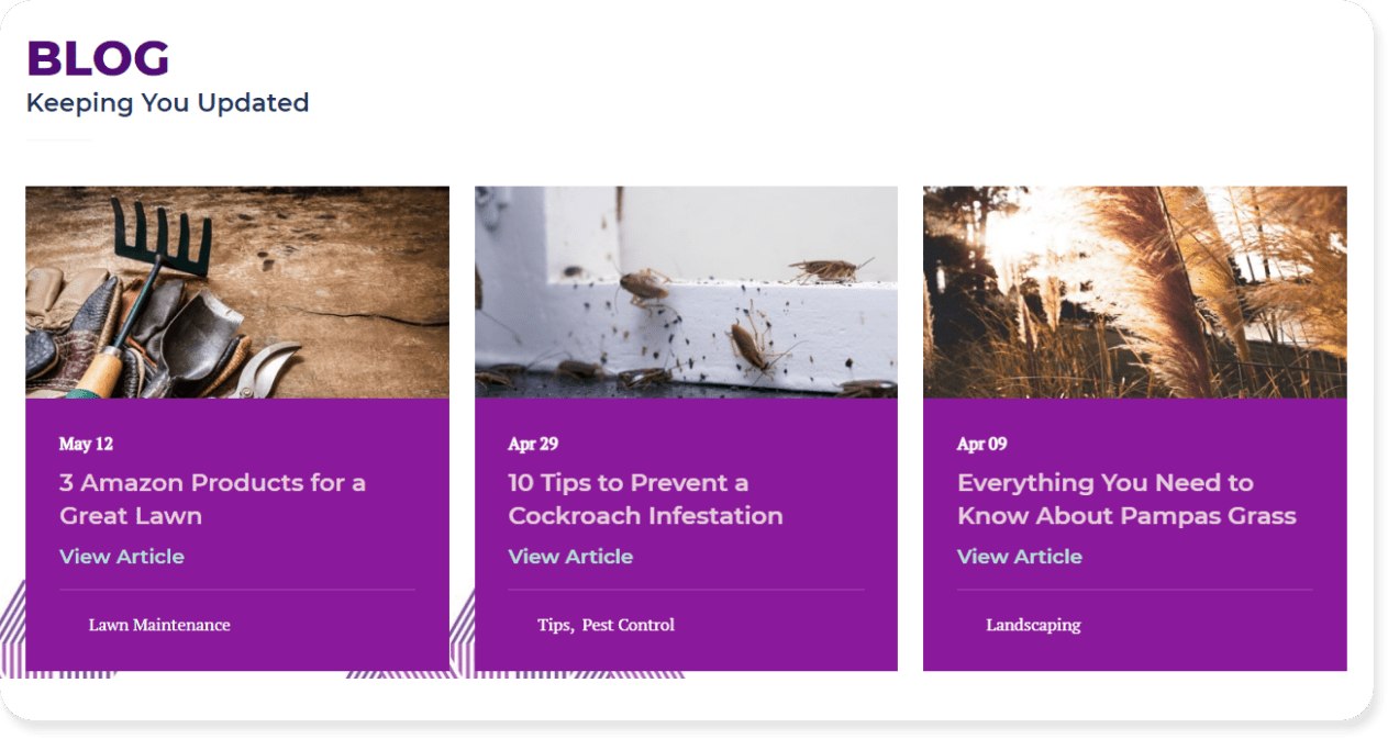
WHY WE LOVE IT: It’s common for landscapers to post blogs about themselves, or to try and sell their latest service. Instead, Purple Care is offering information that has NOTHING to do with their services. A blog titled, ‘3 Amazon Products for a Great Lawn’ won’t land the landscapers at Purple Care a client…at least, not right away. When someone reads that blog and decides they need to hire a landscaper to help their lawn look great all year round, they’re more likely to choose Purple Care to do it.
#11 – The Grounds Guys
High-Converting Feature: Industry Partnerships
The best landscaping website designs keep working for a sale even when people are browsing from page to page.
Getting traffic to your site is crucial, but it’s only half the battle. The remaining half (the tougher half) is to turn that traffic into leads and new customers.
The landscaping team at The Grounds Guys use industry alliances and partnerships to help build trust and push people towards a sale. Even if a site visitor doesn’t know what being part of the ‘National Association of Landscape Professionals’ means, it sure sounds good.
By using the logos of respected industry bodies, The Grounds Guys piggyback on that respect and use it to boost their own reputation.
If they’re trusted by every landscaping body and organization under the sun, they must be doing something right, right?
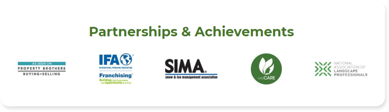
WHY WE LOVE IT: This is known as ‘Perceived Value’, which is the opposite of ‘Real Value’. Perceived value is the customer evaluation on what your services are worth. Let’s say The Grounds Guys charge $5,000 to design and build a stunning water feature. With all these partnerships and industry alliances, a potential customer might think The Grounds Guys services are worth paying twice as much. In this example they could double their prices and that customer would still feel they’re getting a great deal based on the perceived value in their head.
#12 – Precision Landscape
High-Converting Feature: Customer Testimonials & Reviews
Let’s say you were in the market for a new backyard. We’re talking jungle to oasis transformation. Outdoor lighting, stone fireplace, raised garden beds – the whole nine yards.
If you’ve narrowed your search down to two landscapers and your friends and family all have had positive experiences with one of those companies, your choice becomes much easier. You trust the recommendation from your friends and family, which makes it easy to pick one landscaper over another.
Online reviews provide the same positive influence for your business. We won’t bore you with all the data, but the power of online reviews is proven:
- 3 out of 4 consumers trust reviews as much as recommendations from friends and family
- 90% of customers read reviews before making a purchase
- Customers are willing to spend 31% more on businesses with positive reviews
And Precision Landscaping uses this to their advantage with easy-to-read reviews from real customers. The gold stars jump off the page, and the feedback is detailed and honest.
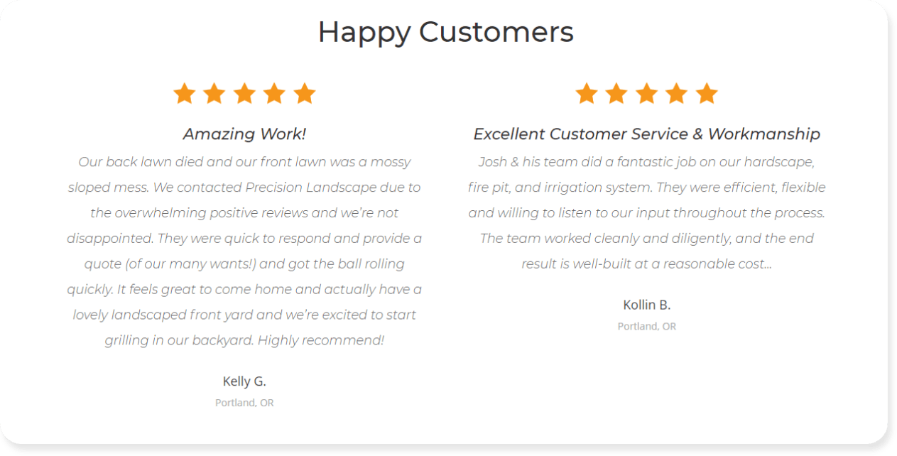
WHY WE LOVE IT: There are plenty of reviews online that read like they were written by a robot. In contrast, these reviews are long and detailed and come across as 100% authentic. This makes it more likely to influence potential customers who relate to the reviews they’re reading.
#13 – Escapes Landscape Design
High-Converting Feature: Social Media Cross-Promotion
The average consumer spends 2.5 hours a day on social media platforms.
The team at Escapes Landscape Design use this to their advantage by including their Instagram feed to cross-promote their business.
Site visitors can effortlessly jump to the company’s Instagram feed to look at individual posts and project updates. This helps create a consistent brand experience across multiple touchpoints, and it helps grow their social media following.
As a business needs an average of 7 impressions before they land a sale, using an Instagram feed can help potential customers learn about Escapes Landscaping Design on their website AND on social media. That’s two impressions down, and a step closer to a sale.
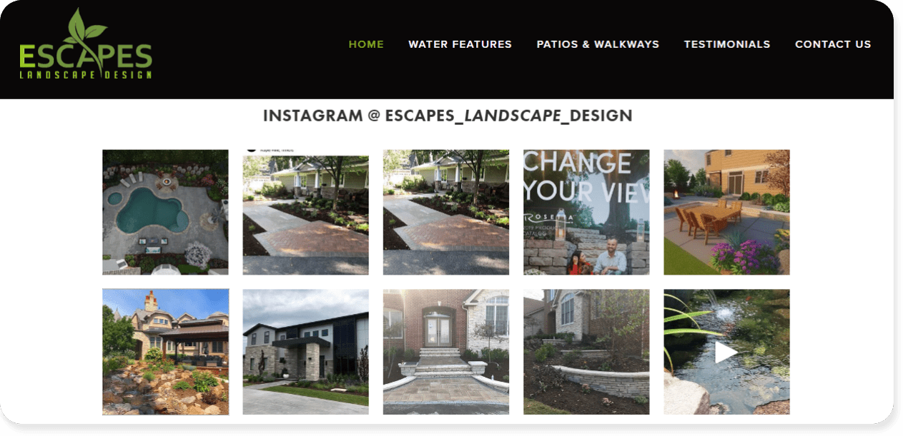
WHY WE LOVE IT: Using Instagram for business isn’t reinventing the wheel. 90% of customers follow at least one brand on Instagram. But this is a prime example of tapping into an existing trend to help grow your brand. It’s super simple, but an embedded Instagram feed isn’t standard on every landscaping website design, so we love to see the unique approach.
#14 – Tomlinson Bomberger
High-Converting Feature: Lead-Generating Referral Program
It’s not easy to find new leads for your landscaping business.
Between running Google Ads and an SEO campaign you can quickly sink 10+ hours and $1,000 a week into your lead-gen tactics.
The team at Tomlinson Bomberger show how easy it is to open up a new source of leads with a referral program that puts the lead-gen work in the hands of their customers instead.
By referring a friend, people are entitled to $50. This is a great deal for site visitors who walk away with a little extra cash. And even better value for the landscaping company who signs up a new client. This could be a small project, or something major, like:
- $800 for small yard maintenance
- $3,500 for a new water feature
- $20,000 for a complex backyard design and construction project
It doesn’t matter what landscaping service your new client needs – your landscaping company still wins.
As a bonus, the average lifetime value of a customer acquired through referrals is 16% higher compared to non-referral customers. So not only does a simple referral program create a new stream of leads, but those leads end up being more profitable too.
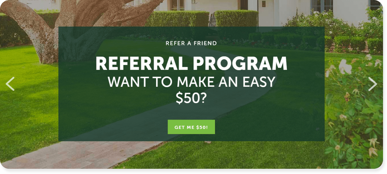
WHY WE LOVE IT: Outside of the referral program, which is proven to be a cost-effective and profitable strategy to generate leads, we love the design. Using white font directly on top of an image can make the words hard to read. Instead, the Tomlinson Bomberger site uses a dark green background that makes each word jump off the page. The call-to-action button of ‘GET ME $50’ also makes it easy for people to take action (who wouldn’t want a free $50?!) which will drive clicks.
#15 – TruGreen
High-Converting Feature: Landscaping App
The average smartphone owner installs 80 apps and uses 30 per month.
With competition for landscaping customers fierce, finding a way to interact with people without distraction is priceless. Google Ads, SEO, Facebook Ads – all of these channels put you in direct competition with other landscapers.
But an app? That’s real estate only you own.
The team behind TruGreen have used this to their advantage with an app designed for customers, allowing people to:
|
|
Are we saying apps are suitable for every landscaper? No.
If you’ve recently started your landscaping company or you’re turning over less than $1 million per year, you won’t need to start developing a branded app. What this landscape website feature does show though, is the need to innovate.
There are 604,163 landscaping companies in the United States, and if your website looks like everyone else’s, why would anyone choose you?
Creating an app doesn’t need to be your #1 priority. But finding ways to offer value on your site should be. Whether it’s an app, or another landscape website design feature from this list, find ways to stand out.
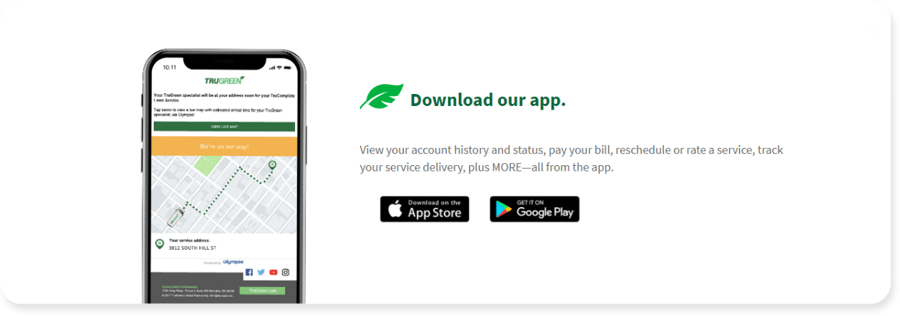
WHY WE LOVE IT: Everyone knows that mobile phone usage is going up year on year. Still, the average smartphone owner isn’t spending their time browsing online. In fact, just 11% of media time is spent browsing online with the remaining 89% spent on apps. In the competitive landscaping industry, communicating with customers through a branded app helps build relationships, showcases credibility, and boosts customer retention.
Use these 15 landscaping website design features on your own site
We’re not recommending you copy the landscaping design features in this list word for word…but they’re being used for a reason.
Because they generate traffic, leads and sales.
Take inspiration from the 15 design features we’ve rounded up and add your own twist. Every element on this list is used because these landscapers (or the agencies building their sites) have been generating more leads, convincing people to hang around for longer, and boosting sales.
So here’s a quick recap of the landscaping website design features that can increase quote requests, leads, and conversions.
| ‘Free Quote’ form above the fold | Time-sensitive deals and promotions |
| Eye-catching GUARANTEES | Multiple CTA buttons |
| Customer testimonials & reviews | Landscaping project gallery |
| Location pages for Local SEO | Free roofing blogs and articles |
| Industry partnerships | Innovative technology (like apps) |
| ‘Why Choose Us?’ section | Customer referral program |
| Trust badges | Pop-Up ‘Free Quote’ boxes |
| Social Media cross-promotion |
“I don’t have a landscaping site yet, what are my options?”
These landscaping website design ideas are hard to implement if you don’t have a site.
Luckily, creating a website is easy and affordable in 2021. You’ve got options so you can outsource the job to a web design agency (ahem, *us*) or build your own site with zero experience.
Seriously, website builders are designed for busy roofers who only have a spare hour but still want a new site. You just pick a ready-made template, click a button and *boom* you’ve got a website.
If you’re ready to take what you’ve learned and apply it to your own site, check the option below.
