
The 30 Best Contractor Websites [Design Examples + High-Converting Features]

If you want to connect with more customers and get your home improvement business on the map, you need to get online and make your website stand out. Here are 30 examples to inspire you and show you how businesses like yours are getting it right.
Home improvement is big business – and it’s only getting bigger. It’s estimated that the home improvement market will be worth $1,009 billion by the year 2027.
That adds up to huge profit for the contractors that know how to connect with their market.
The easiest way to connect with your market? Updating your website.
Think about it, if you want to attract new customers, you have to find a way to reach them and with 4.66 billion active internet users, it’s safe to say they’re online.
But how do you make your website stand out, provide the right information and attract new clients without being off-putting or confusing? Turns out it’s easier than you think.
Scroll down for the 30 BEST contractor websites and learn what makes these websites stand out from the crowd (that’s code for ‘steal their best design features and high-converting elements).
Best General Contractor Websites To Look Up To
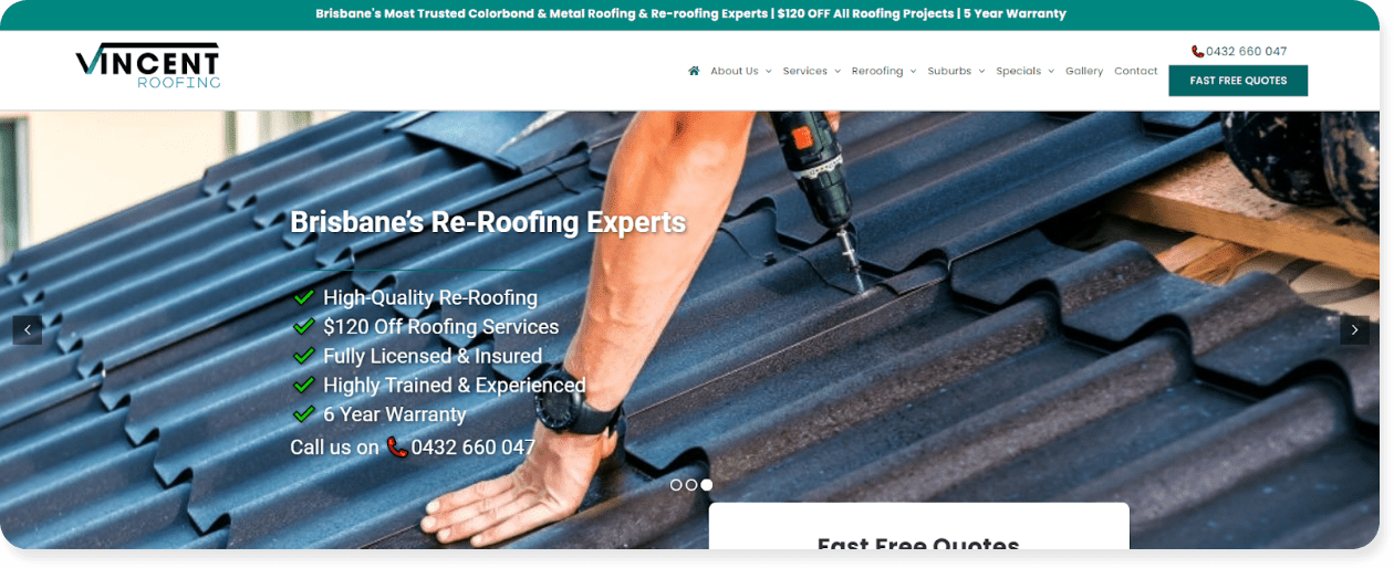
#1 – Vincent Roofing
Vincent Roofing specializes in colorbond, metal and zincalume roofing and reroofing projects. They cater to a very specific market, and their website does a great job at speaking to that market by:
- Breaking down barriers and explaining why they’re better than their competition
- Establishing the company’s expertise and experience in the field
- Clearly explaining their contracting services
- Driving site visitors to take action
The best part? This custom-made website (made by our own Tradie Digital team) accomplishes all of this in a no-frills style.
Each page establishes their credibility and encourages the customer to take action by asking key questions like, “why is it crucial to maintain your Brisbane roofing?”. This helps the website rank for contractor-related keywords AND gets inside a customer’s head to position the Vincent Roofing Team as an expert solution.
This contracting site also offers plenty of ways for site visitors to get a quote, while making their offerings clear and easy to understand. This makes it simple for people to find the roofing service they’re looking for, and engage with the company.
Why we love it: We may be biased, seeing as we created this site, but we’re big fans of the above-the-fold layout. Displaying all the most important info and promoting their services with trust indicators like ‘$120 Off Roofing Services’ and ‘6 Year Warranty’ help drive clicks, calls and customers.
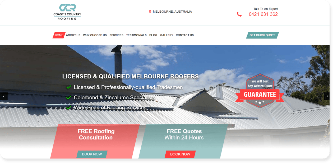
The best websites convert customers by making them want to book a service on the spot – and Coast2Country’s website, built on the Pedestal platform, does exactly that.
Hiring a contractor requires trust, which is why this site’s multiple trust indicators are so effective. These include:
- A “We Will Beat Any Quote” guarantee at the top of their homepage
- Easy to find buttons and phone numbers that allow their audience to easily schedule a free quote or a consultation
- The ability to secure a quote within 24 hours, further removing friction between a quote request
As customers scroll, they can also find all relevant services easily, while learning what sets Coast2Country apart from the competition. In short, this contracting site has all the information a customer might be looking for directly on the homepage.
Why we love it: Site visitors are notoriously fickle. If info is hard to find, they’ll bounce back to Google to look for an easier way. This website takes this customer psychology and applies it with all relevant info, including multiple quote request options, without needing to scroll down a single pixel.
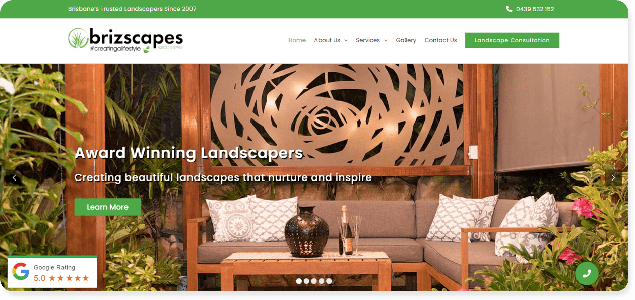
#3 – Brizscapes
Brizscapes is a Brisbane-based landscape construction business focused primarily on landscape design. Their modern website, (again, built by our expert team at Tradie Digital) is a perfect example of a landscaping website done right.
|
|
At the same time, this website provides clear information about their landscaping services along with customer reviews to establish trust.
Site visitors can learn more about their services and selling points via the carousel header image, ensuring no scrolling is needed.
Why we love it: 94% of site visitors believe a website’s #1 most valuable feature should be ease of navigation. This is on display here with a website that’s not just modern, but informative, and easy to navigate – which will result in more clicks and more leads.
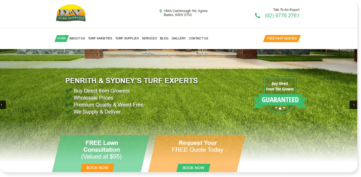
#4 – D&V Turf Supplies
D&V Turf Supplies offers turf supplies and landscaping services in Penrith and Sydney, Australia.
Their website – built on Pedestal’s user-friendly platform, is ultra-focused on delivering comprehensive information about their services and encouraging action from the audience through well-placed CTAs.
Specifically, you can see D&V Turf’s top four selling points atop their homepage:
- Buy direct from growers
- Wholesale prices
- Premium quality & weed free
- We supply and deliver
This strategy helps address customer concerns and answers questions off the bat — which in turn can encourage site visitors to keep scrolling and move towards becoming a lead.
Why we love it: D & V Turf Supplies’ site is the perfect example of a call-to-action done right. It’s direct, short, and creates perceived value by including the worth of a free quote, in this case that’s a $95 service the customer is accessing for free.
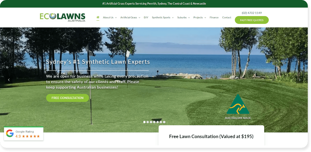
#5 – Ecolawns Australia
Ecolawns Australia is a family-owned business that specializes in supplying and installing artificial grass in Penrith, Sydney, the Central Coast, and Newcastle.
The best thing about this custom-built, Tradie Digital website is the amount of information it provides without overwhelming the eye or confusing the reader with jargon.
Check out the homepage which acts as a digital salesperson by sharing:
- The history and reputation of the business
- The primary selling points, or “Why Choose Us”
- The services offered
- Frequently asked questions (FAQ)
The FAQ section, in particular, answers multiple questions which not only helps provide information a potential customer needs to make a purchasing decision, but boosts their SEO.
Why we love it: Their homepage has super informative, easy-to-follow modules. No extra fluff, no missing information. And with the copy optimized for a range of contractor-related keywords, the Ecolawns team is driving leads through Google.
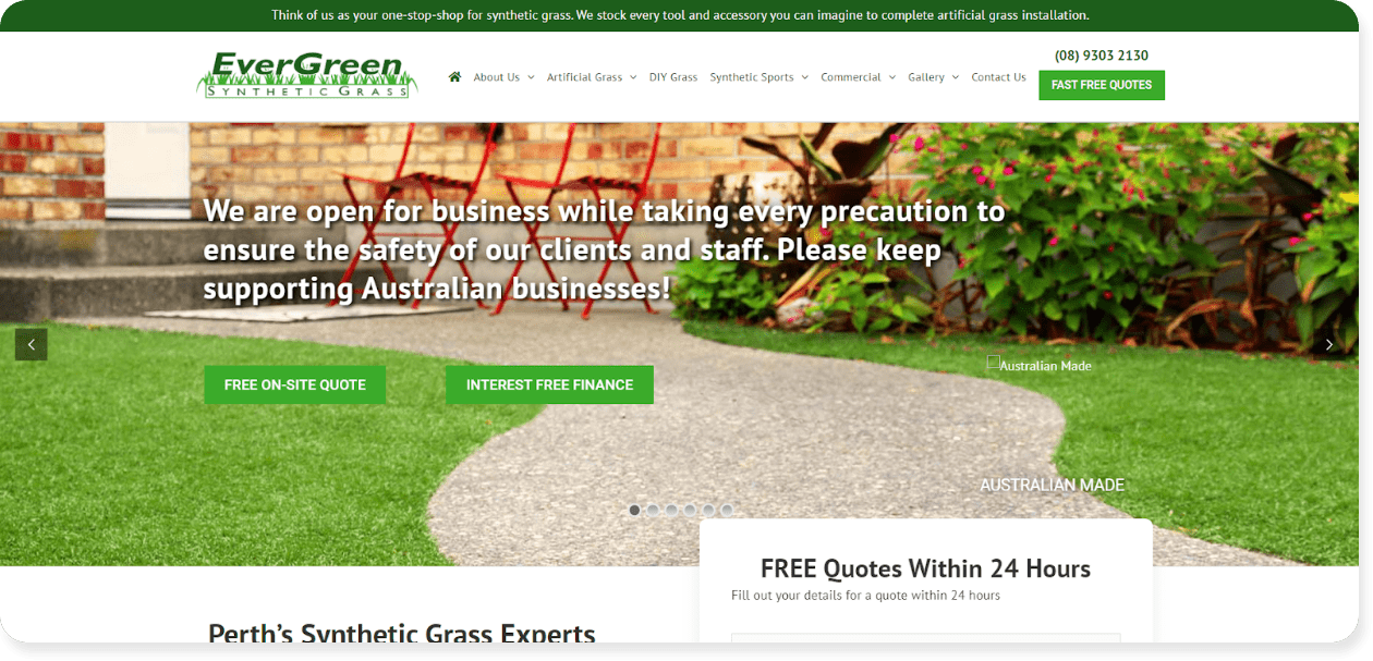
Evergreen Synthetic Grass is a “one-stop-shop” for artificial grass purchase and installation.
In addition to offering comprehensive and clear information, Evergreen’s website shares unique selling points that help bring awareness and speak to a potential customer’s pain points.
This ability to create content around customer psychology – along with social proof and testimonials – helps their contracting site stand out from the competition.
Why we love it: Evergreen touches on social and environmental issues to emotionally connect to the reader. It’s a mistake to think customers act on logic, when it’s emotion that drives much of their buying behavior. By targeting a customer’s pain points, the Ecolawn site makes a deep personal connection that will help bring in more enquiries.
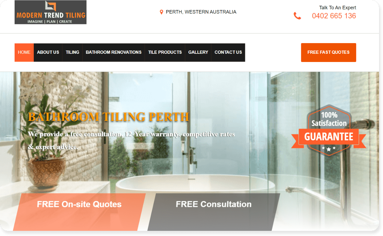
#7 – Modern Trend Tiling
Modern Trend Tiling offers tiling and bathroom renovation services in Perth, Australia.
On their custom-built website, the company follows all the best practices we’ve already discussed, but our favorite part is the section breaking everything down in easy-to-understand, clear language, including:
- Their tiling and renovation process
- The products they use in their remodels
- What makes their services different, which includes extensive experience and comprehensive warranty offerings.
- Multiple ways for customers to get in touch, including via phone, contact form and CTA.
It’s easy, it’s clean, and it’s super effective. Every contractor should take note and provide similar information on their site.
Why we love it: They literally explain the 1-2-3 of working with them so their customers are never confused. Every contracting website needs to find ways to remove the friction between a site visitor and a sale, and by outlining their process, this website helps clear the way for more leads.
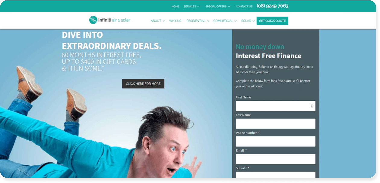
#8 – Infiniti Air & Solar
Infiniti Air & Solar offers air conditioning service and installation, along with solar AC systems in Perth, Australia. The team uses their website to emphasize their speed and the value of their services in a fun, easy-to-follow website.
Throughout their website, they use powerful, emotionally-driven language like:
- “Dive into extraordinary deals”
- “Free on-site quote within 48 hours”
- “Free report: 5 things you need to know before purchasing an AC unit in Perth”
This approach to their copy triggers feelings of scarcity, exclusivity, and value and helps convince a site visitor they’re getting a spectacular deal by reaching out.
Why we love it: Language is power. This website uses compelling language that encourages the customer to take action on the site, targeting feelings of exclusivity to make site visitors feel like they’re getting a great deal.
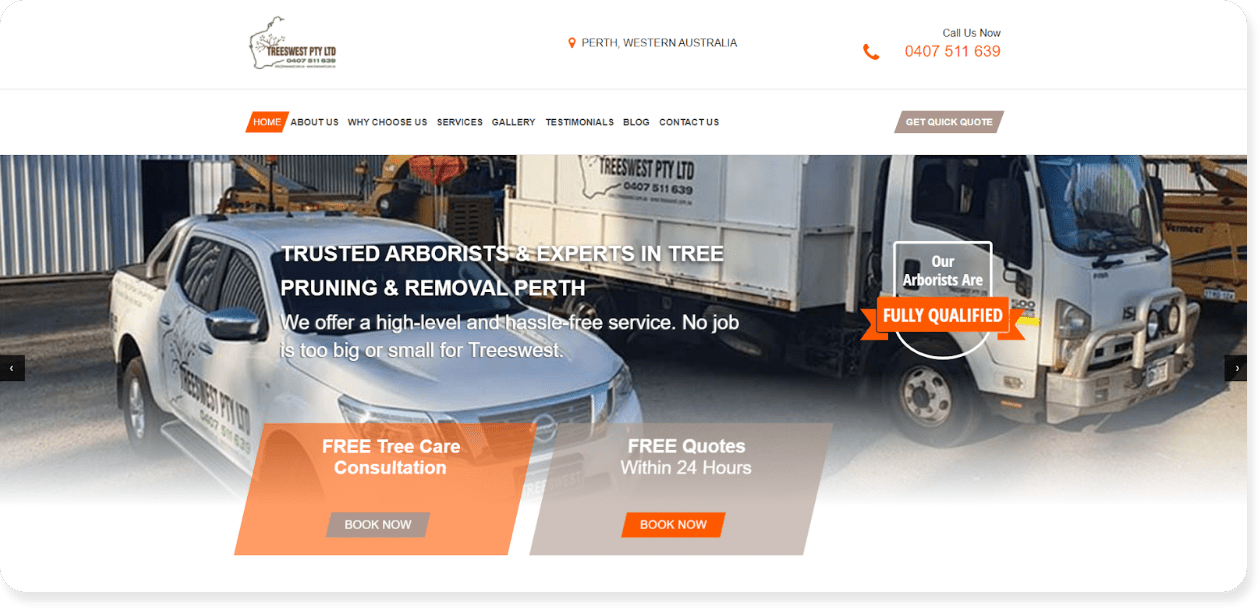
#9 – Tree West
Tree West is a team of arborists that offers tree removal, stump grinding, tree pruning, and related services. Their custom-made Tradie Digital website really emphasizes that Tree West can do it all.
To build trust, the Tree West homepage establishes:
- Their team’s qualifications
- The diversity of their portfolio and capabilities
- Their long-standing position in the industry
- Their 24/7 availability, and more.
They also feature customer reviews from a variety of scenarios. All of this not only answers questions but also increases brand trust throughout the engagement with the company.
Why we love it: 91% of Millennials trust online reviews as much as they do recommendations from friends and family. By utilizing reviews, this website helps provide peace of mind and generates more quote requests by turning previous customers into brand advocates.
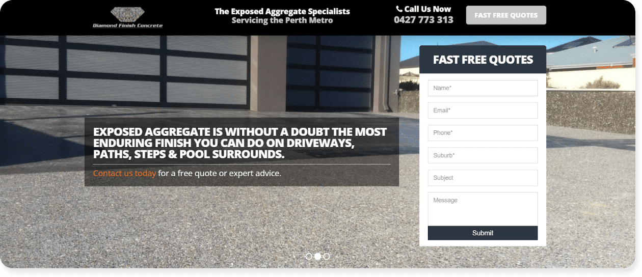
#10 – Diamond Finish Concrete
Diamond Finish Concrete is a family-owned business in Perth that offers a variety of concrete services, although they specialize in exposed aggregate concrete. We love how Diamond Finish Concrete really plants their flag with a specific product: exposed aggregate concrete.
Although they offer other concrete options, including stamped concrete, honed concrete and pool concrete, it’s clear that exposed aggregate concrete is their bread and butter.
This is a great note for all contractors: if you have a specialty, make sure it’s clear on your website from the start. This not only carves out a niche for you in the industry, but also encourages customers to choose you if they’re looking for the best in the business.
Why we love it: The Diamond Finish Concrete team chose a specialty and pushed it throughout their website. This kind of specialization can help any business find their niche and stand out from the crowd. Remember, you don’t want to be everything for everyone. By finding a niche audience, you can become a trusted, local expert.
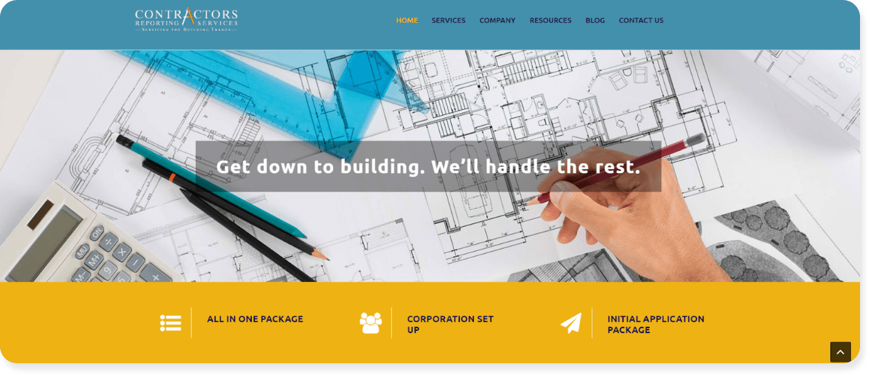
Based in Florida, Contractors Reporting Services is a business that helps contractors become licensed and prepared for jobs in the field.
The first thing you see when you land on the company’s homepage is the slogan, “Get down to building. We’ll handle the rest.” This quickly establishes trust and sets the tone for the rest of the site while sending a simple message: they’ve got you covered.
This type of clear, effective messaging is re-emphasized throughout the rest of the site, both through descriptions of services and through powerful value statements.
Why we love it: Simplicity is effective. Sometimes, the best thing you can do is come up with a great message and stick to it. Contractors Reporting Services does exactly that by focusing on the benefit of their service, which is to simplify complex problems.
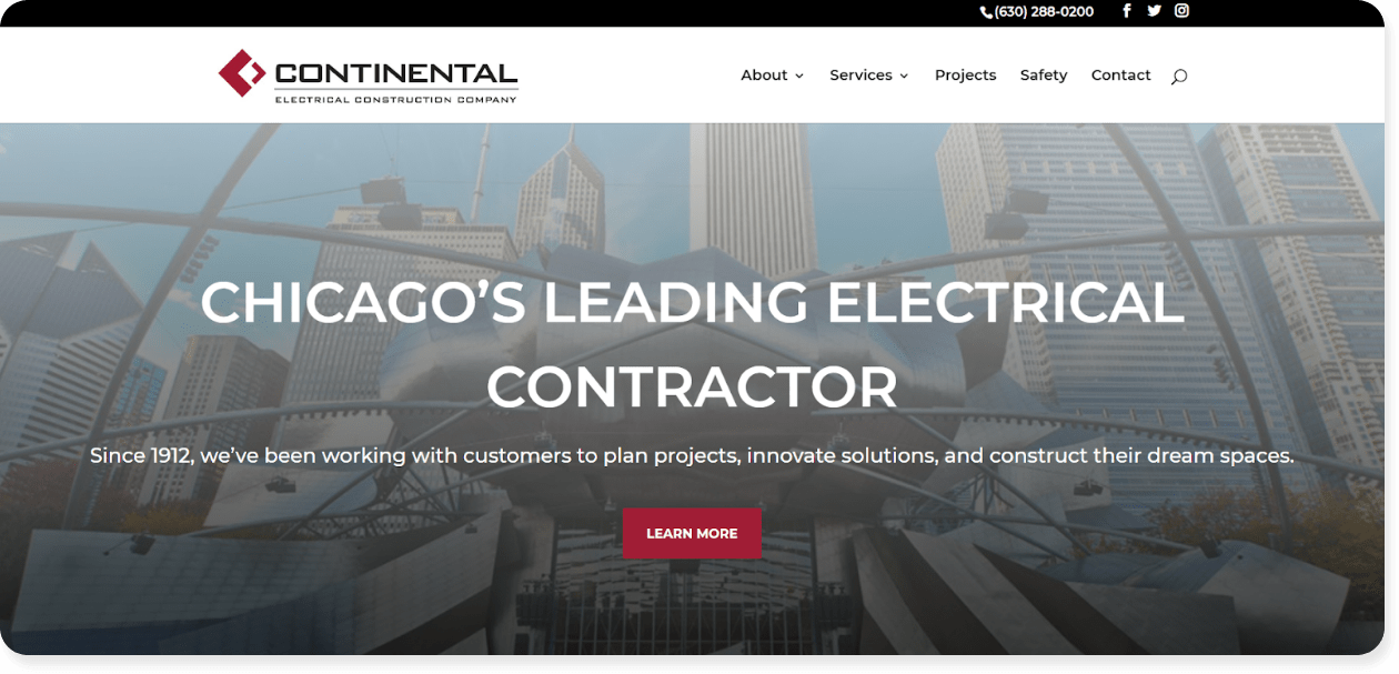
Continental Electrical Construction Company is a Chicago-based business providing an array of electrical solutions, helping with design, construction, diagnostics, maintenance, and repair.
Their website’s homepage is super sleek, clear, and effective in its messaging which three main modules:
- Services: This shows all services via clickable icons and helps convey the right information at a glance.
- The Chicago Skyline is our Resume: This section establishes the business’ authority and explains their “About Us” in a unique and interesting way.
- Latest Projects: A section of case studies to help the audience find projects similar to what they’re looking for.
Short, sweet, and to the point.
Why we love it: Continental Electric picked three main points and stuck to those on their website’s homepage. This clarifies their messaging and eliminates confusion about who they are or what they do.
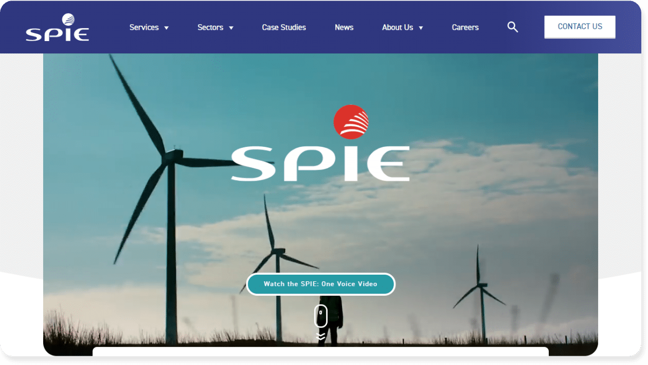
#13 – Spie UK
Although not exactly a contractor website in the traditional sense, we thought this site was worth including because it brings up a great point – if you offer a complex product or service, you must make it simple and interesting to your audience.
Spie UK accomplishes this by displaying:
- Powerful explainer video on the homepage.
- A clear, visually pleasing homepage layout that shows their services, sectors, and social proof.
Why we love it: This website simplifies a complex service through ultra-explanatory, easy-to-follow website content. 38% of people will stop engaging with a website if the content is unattractive, which the Spie UK team have taken into account when organizing their user-friendly content.
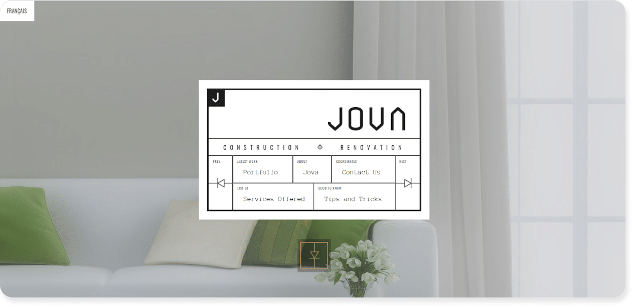
#14 – Jova Construction
If you want to check out a website that is truly different and modern, look no further than Jova Construction.
A home improvement business that focuses on building long-term relationships with its customers, Jova’s website is genuinely interesting and unique, offering lots of unexpected animations and imagery like:
- Responsive navigation located in the sidebar, rather than the header
- Animations that move when the user hovers over a section.
- Unique typeface and moving copy to boost engagement.
These elements encourage the viewer to scroll through and see what might pop up next. This not only piques the viewer’s interest but helps set apart Jova’s brand identity and create a one-of-a-kind message — without the company having to say a word.
Why we love it: This contractor website offers a modern, unique design that is sure to draw interest and make a lasting impression. You don’t necessarily need moving elements, but look to find ways to make your website engaging.
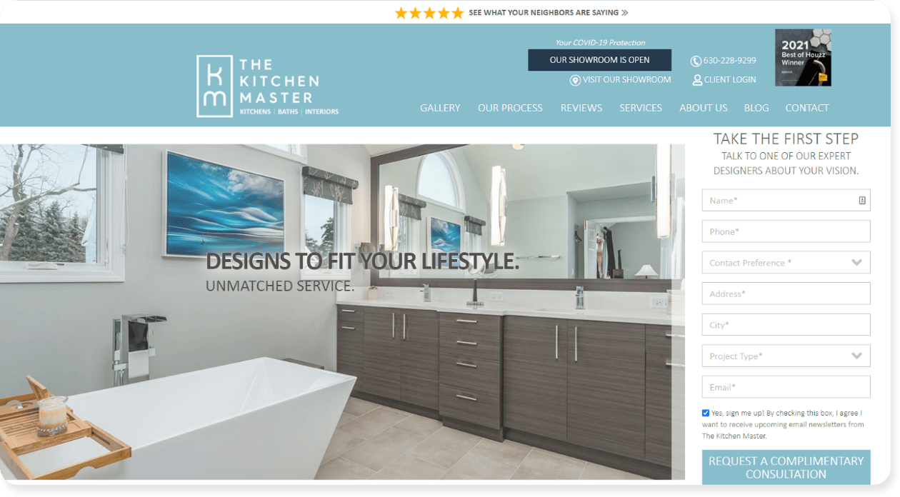
#15 – The Kitchen Master
The Kitchen Master is a kitchen and bathroom remodeling company based out of Illinois, USA.
Our favorite part of their website is the comprehensive photo gallery of their services and remodelling projects. We’ve all heard that a picture is worth a thousand words, and this is especially true when you have something tangible that you’re offering.
Showing the range of options available to site visitors can not only inspire them to contact you but also build trust in a way words alone can’t.
The short version? Don’t forget to include great images on your website.
Why we love it: This contractor website uses photos and video to great effect to showcase their skills and services. People retain 10% of information through text, but 65% when that text is paired with images, so use high-quality photos to your advantage.
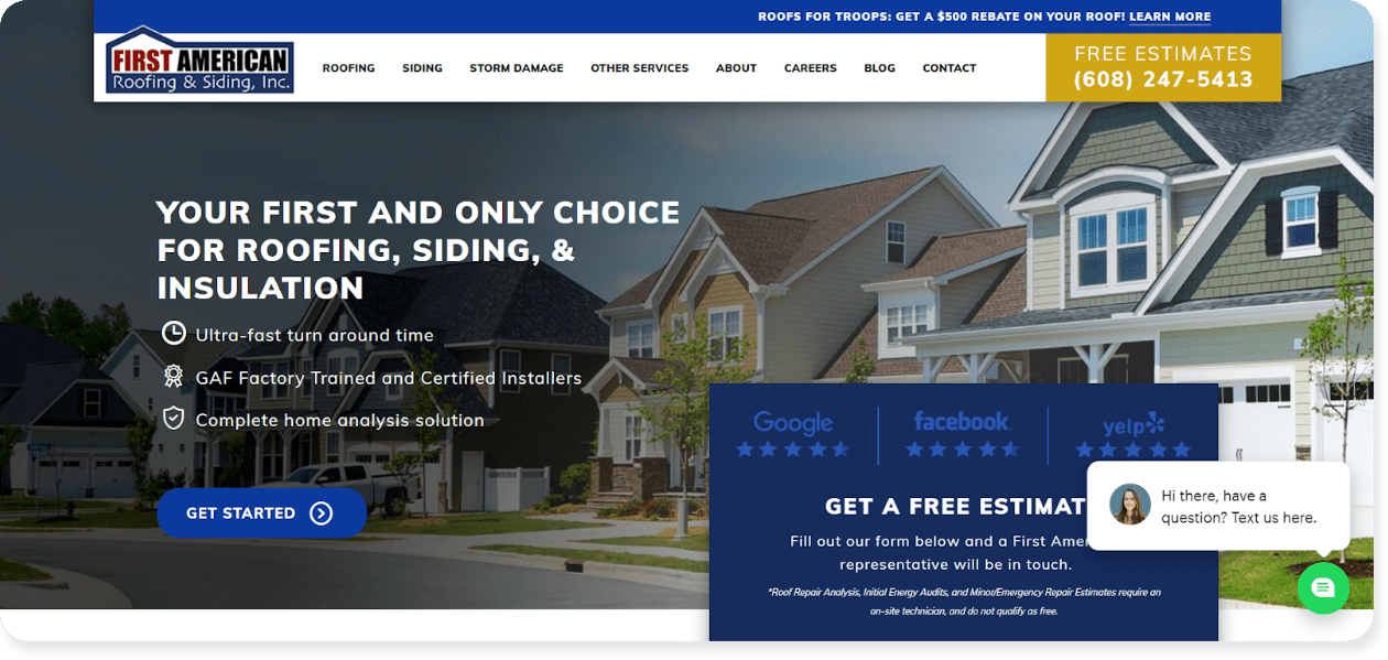
#16 – First American Roofing
First American Roofing & Siding, Inc., is a roofing, siding, and insulation business based in Wisconsin. Throughout their website, this business is bold with their messaging. From the moment you land on their site you see their value statement (“Your first and only choice for roofing, siding, and insulation”) with ratings from Google, Facebook, and Yelp.
The overall message? We’re the best, and we’ve got the proof right here.
This kind of statement is highly effective when it comes to a contractor website. After all, people won’t feel confident in your offerings if you don’t offer them proof of your quality.
Why we love it: Their bold messaging conveys confidence and expertise in the field. Remember, contracting customers don’t commit to a hire on a whim. Help guide them to your services with your own confidence indicators – reviews, customer testimonials, or peace of mind guarantees’.
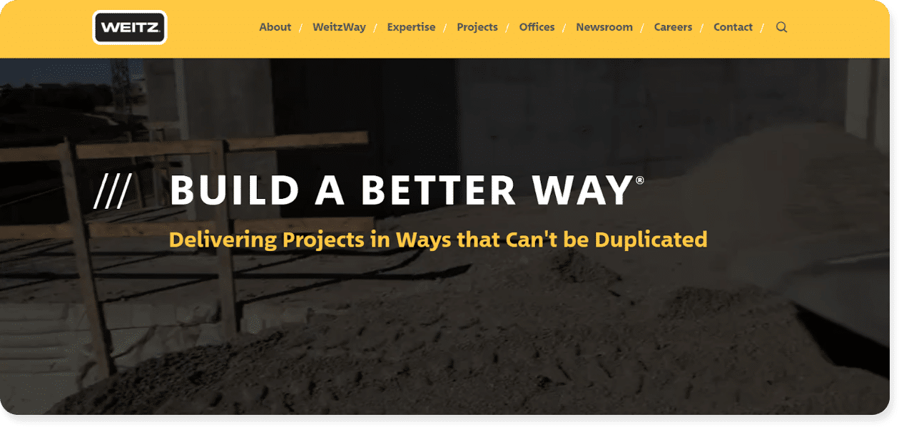
#17 – Weitz
Weitz is a full-service contracting, construction, and design business based out of Mississippi.
On their website, the company has a range of graphics and numbers that help establish their authority in the industry. For example:
- $1,000,000,000+ in annual revenue
- 1,000 employees
- 165 years in operation
- 10 offices around the United States
These facts are impressive, and establish Weitz’ credibility without them having to expressly say it.
Why we love it: This website utilizes stats and numbers effectively to emphasize their expertise and build trust with their customers. Look for figures related to your own contracting business that can help tell a story and establish credibility.
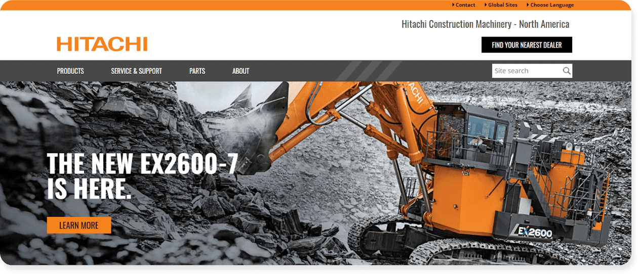
#18 – Hitachi Construction
Hitachi Construction is a construction company that sells various excavators across the United States and their website is exactly what you’d expect in all the right ways.
Their striking orange and black color palette matches the branding that you see with most construction stores and materials with pictures of excavators throughout the site and a clear navigation projecting their professionalism..
Why we love it: Hitachi sells construction excavators – that’s it. And their website makes that crystal clear. When messaging is targeted, you’re more likely to attract relevant site visitors and generate quality leads.
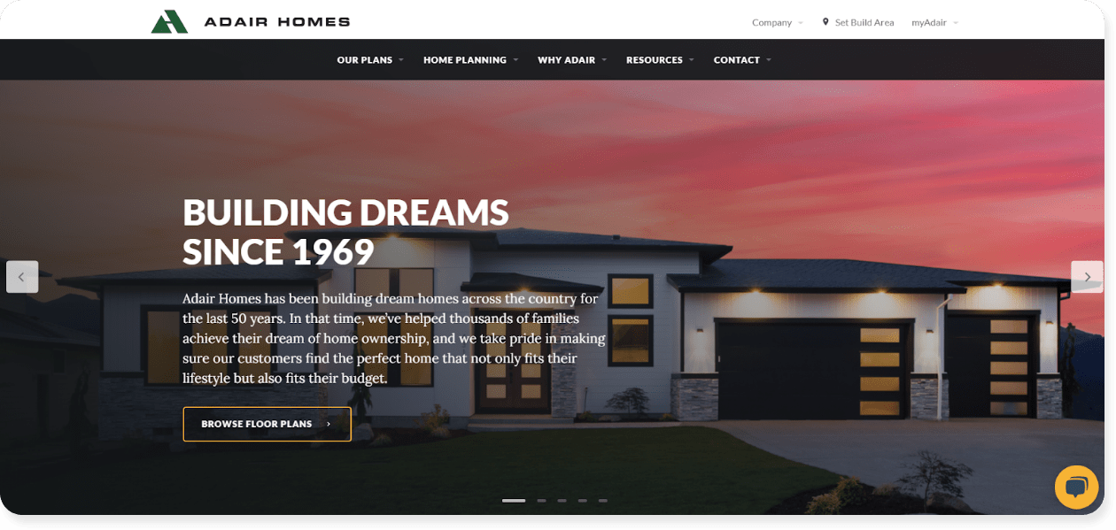
#19 – Adair Homes
Adair Homes is a luxury custom home building company based in the Western United States.
Whenever a company offers “custom” anything, it can be easy for their website to become cluttered and difficult to navigate. Adair Homes’ website is none of those things as they clearly lay out:
- All possible home plans and floor plans
- What the home construction process looks like from start to finish
- A photo gallery to help.
They also offer virtual open houses and seminars that anyone can attend. This is a creative touch that can boost customer engagement and establish their expertise in the field.
Why we love it: The Adair Homes team uses their website’s navigation to explain their products and services in a clear, easy-to-follow way. The easier a site visitor can navigate from page to page, the less friction there is to generating leads.
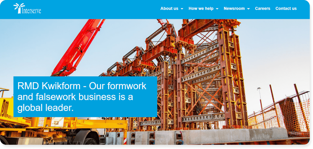
#20 – Interserve
Interserve is a U.S.-based company that offers construction, equipment, and probation services. This is one of the few websites we saw that uses case studies — or comprehensive customer stories — to show:
- How they helped a client rebrand their business
- How customers benefit from their equipment services
- How they help their communities
Case studies can be a powerful method of communication if you offer a complex service that people need to see “in the field.”
Why we love it: Without a case study, you could get bogged down trying to explain all the details – and Interserve does a great job of avoiding that through thoughtful, effective customer stories. If you’ve got a track record of success, show it off.
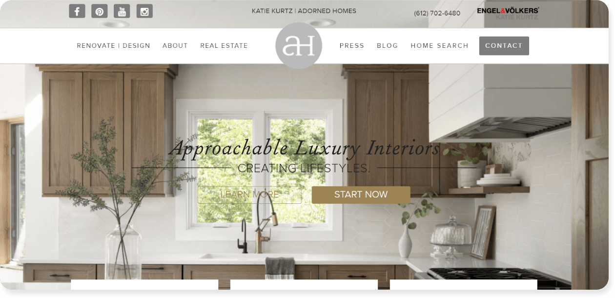
#21 – Adorned Homes
Adorned Homes is a company that offers luxury interior design in Minnesota, USA. This business does a great job at establishing their brand identity as a sleek, luxury interior design company.
Every element speaks to refined luxury and cleanliness, including their website design, imagery and typeface.
This kind of consistency is more important than you might realize. Think about it, suppose you offer luxury remodels, but your website is clunky and the colors clash. Do you think customers will feel confident having you re-do their homes?
Nope.
So follow Adorned Homes’ model and make sure there’s consistency between what you say and what you show on your website.
Why we love it: This website’s design, copy, imagery, and layout consistently displays luxury and refinement, helping to establish the company’s message and brand identity. Your contracting website should reflect your core business values, whether that’s luxury, sustainability, speed, etc.
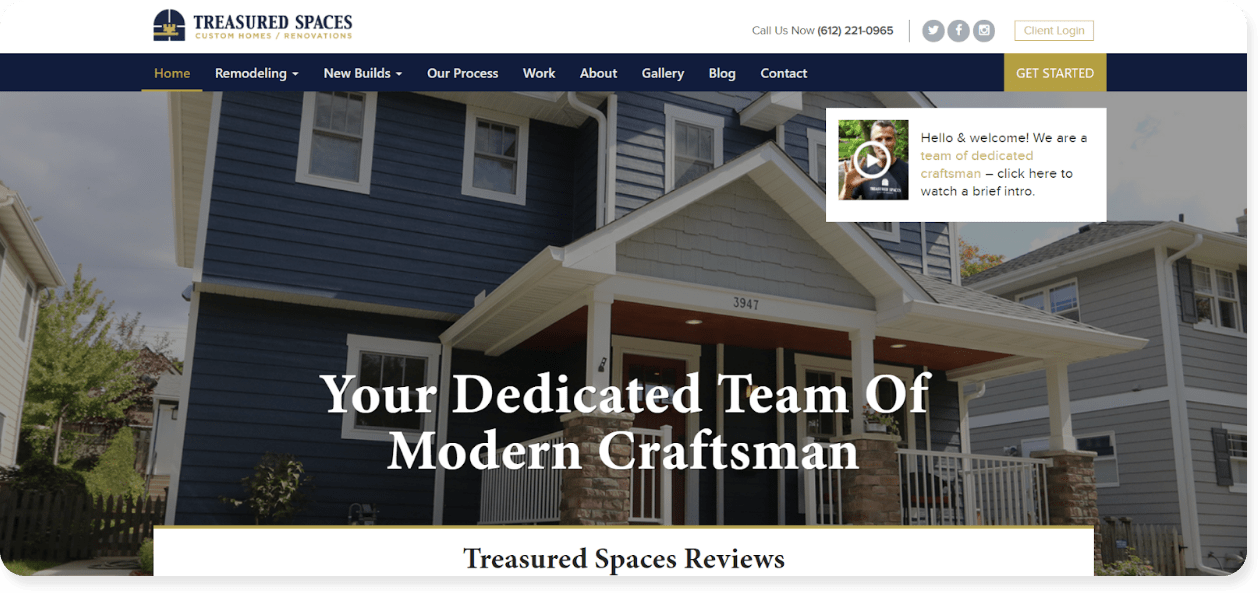
#22 – Treasured Spaces
Treasured Spaces is a Minnesota-based company that offers custom homes and renovations throughout the state.
On their website, Treasured Spaces leads with reviews and accreditations. Reviews are common on contracting sites, but the accreditations are particularly effective.
This is especially powerful when it comes to a major purchase, like home remodelling, as customers want proof that their chosen contractor knows their stuff. And an A+ rating with the Better Business Bureau (BBB) offers that proof.
Why we love it: This contractor’s website uses reviews and accreditations to establish their presence as experts in their field. If you’ve earned industry awards, make sure your site visitors know about them.
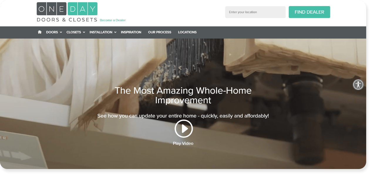
One Day Doors and Closets offers door and closet improvements across the United States with a value proposition that is unique. This value proposition includes:
- Digital measure and design appointments
- 3D measuring technology, and
- One-day installation of new closets and doors.
In other words, they take the entire design and installation process into the 21st century and address many concerns – like wasted time and spiraling costs – right off the bat. Put simply, they’ve built a better mousetrap, and their website is designed to share that advantage.
Why we love it: This company’s website adds a modern flare to the classic remodelling service, helping them stand out from competitors.The inspiration for your site is to find your advantage, or your Unique Selling Proposition (USP) and is it to leverage leads and sales.
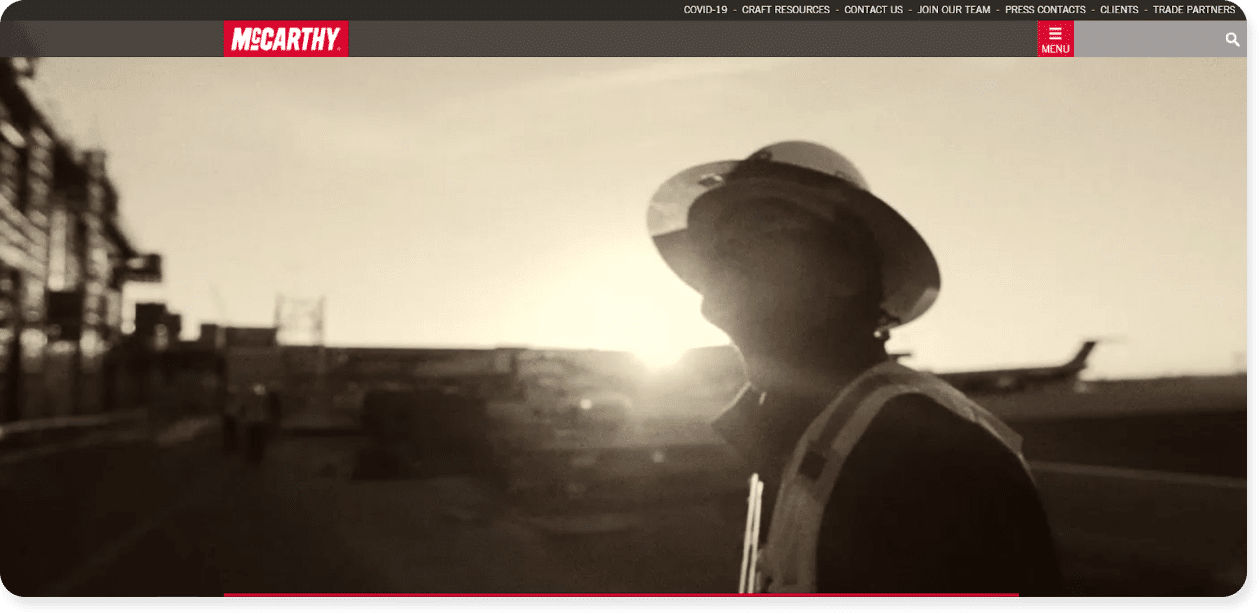
#24 – McCarthy
McCarthy is a building business based in the United States. The company does a great job of mixing old-world, “established” messaging — like black and white photos and a great “About Us” section — with modern elements like:
- Moving graphics
- Videos
- Social media modules
This effectively establishes the company’s presence while letting people know that they’re not dealing with an outdated operation.
Why we love it: You don’t have to choose between old-school and modern to be successful, and McCarthy’s website proves that point extremely well. Be willing to embrace technological trends and web design styles to showcase a modern side to your contracting business.
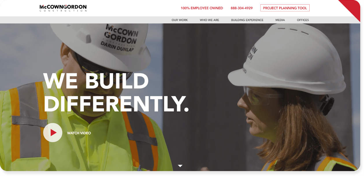
There are countless construction companies online in 2021, yet McCown Gordon Construction company stands out by establishing itself as a “people-first” business.
How do they do this?
- All their imagery includes people
- They lead with their COVID-19 response plan
- They claim that they have a “people-first way of doing business”
- They share that the business is “100% employee-owned”
When you put people first, your site will build rapport in a way other contracting sites can’t.
Why we love it: This contracting site leans into the humanity of the construction business, and the user-friendly design of their website backs that messaging up very well. Remember, people do business with people (not businesses), so make the human user experience your priority.
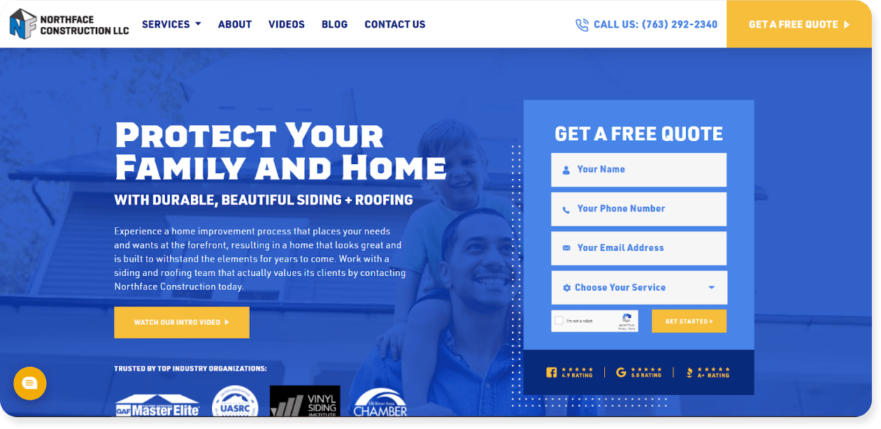
#26 – Northface Construction
Northface Construction is a siding and roofing company based in Minnesota, USA. If there’s one thing that’s super clear on this company’s website, it’s that customers can get a hold of them easily and quickly.
This is all made possible with a long list of features on their site, including:
- A contact form in the upper navigation.
- A phone number in the upper navigation.
- An in-line contact form.
- A chat bot.
- Directions to their store.
- A “free quote” CTA.
Multiple contact options are effective in driving conversions and breaking the ice with customers.
Why we love it: Site visitors come from a range of devices (mobile, tablet, laptop) and the various contact forms speak to this variety. Smartphone users can click the phone number, desktop users may prefer the chatbot, etc. When you give your audience multiple ways to contact you, you’ll find more emails in your inbox each morning.
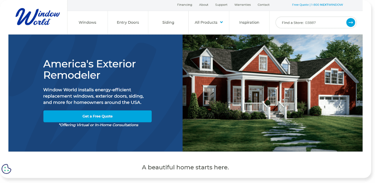
#27 – Window World
Window World offers window, door, and siding installation across the United States with a compelling “Why Window World” section.
This eye-catching addition discuss the benefits of their service, including:
- Increasing curb appeal
- Improving energy efficiency
- Enhancing quality of life
- Taking the hassle out of the purchasing experience
In other words, they’re looking at things from a financial perspective, an environmental perspective, and a quality of life perspective.
This combination of financial and environmental incentive can convince site visitors to move forward with a quote request or purchase, reinforcing the need for contracting companies to lay out their selling points in a similar way.
Why we love it: It’s important to connect with your audience and what matters to them. Window World does that directly on their homepage and you should too. Take the time to understand your customer’s needs. Are they looking for financial savings? Sustainable services? Or is safety their #1 priority? When you understand your customer, you can create a website and copy that speaks directly to them.
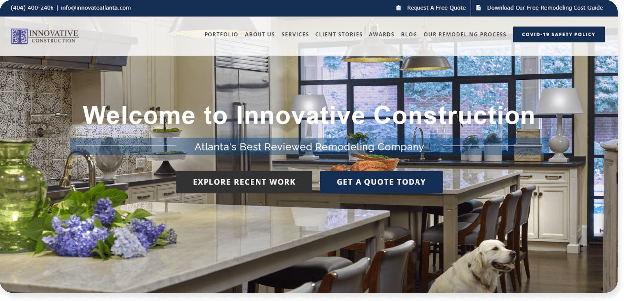
#28 – Innovative Construction
Innovative Construction is a renovation company based in Atlanta, Georgia. Though their entire website is an effective sales tool, we particularly like the blog section that discusses remodeling ideas, including topics like:
- A Tranquil Attic Renovation
- A Classic Bathroom Design
- 7 Coffee Station Idea
In short, they offer inspiration and ideas for anyone that lands on their site, and this kind of informative, relevant insight helps funnel site visitors towards a conversion. Remember, people don’t want to feel like they’re being sold to. They want to feel like you want to help them – and a blog is a great way to get that idea across.
Why we love it: This contracting website uses a company blog to “start the conversation” and build relationships with their customers. Businesses who blog receive 67% more leads than businesses who don’t blog, so consider adding a blog to share your expertise and get more work.
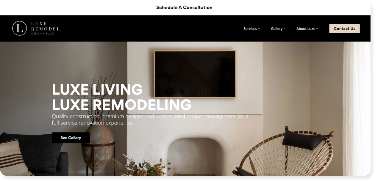
#29 – Luxe Remodel
Luxe Remodel is a construction, design, and project management company based in Los Angeles, California. Their website is very clean and intuitive with the upper navigation only offering three drop-down options: Services, Gallery, and About
Their website utilizes a clean layout and a lot of neutral tones for a simplicity that helps drive people’s eyes to key areas on the page, like their “Schedule a Consultation” form.
Why we love it: The website’s simple navigation and design can help guide the audience’s eye to the right information and CTAs. More is less when it comes to web design, so avoid the clutter and strip back your site to show people what to do, and how to do it.
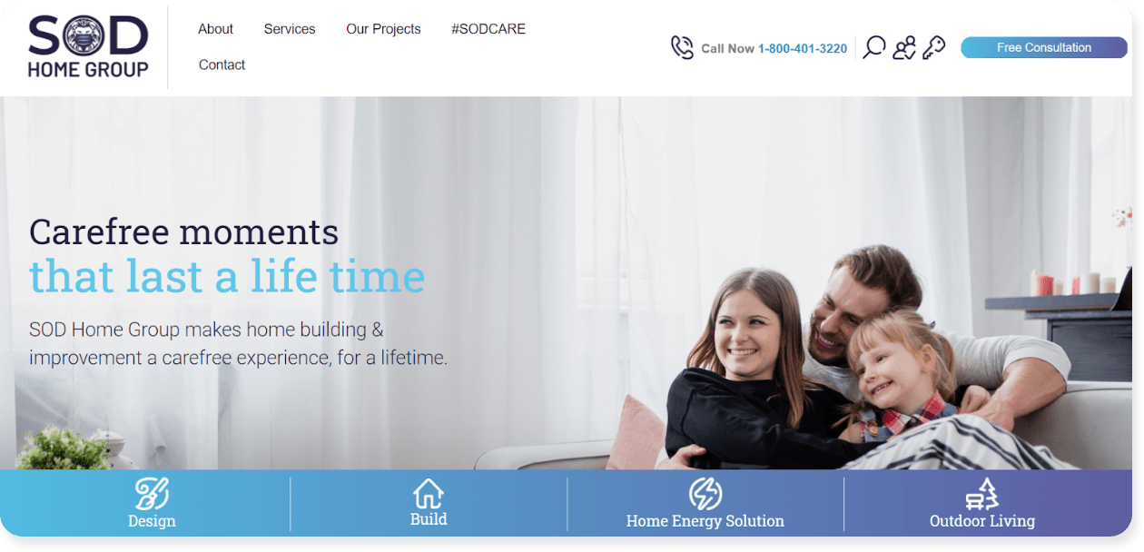
#30 – SOD Home Group
SOD Home Group is a home building and improvement business based in California.
The company has an entire section on their homepage dedicated to their “on-time completion guarantee.”
We love this because they know that remodels tend to run over time and they address that concern head-on. This can set them apart from the competition and ease viewers’ hesitations right off the bat.
Why we love it: SOD picked a common pain point and assured consumers that they’ve addressed it once and for all. This can help them stand out from their competition in a major way. Once you identify your customer’s pain points, consider creating guarantees or promises around them to build trust and drive business.
Ready to transform your contracting website?
We’ve talked about a lot of different elements and features to keep in mind when creating your contractor website.
If it all feels like a lot, well…it is.
Because a successful contracting site – one that generates traffic, leads and sales – is a collection of moving parts. So it’s OK if your site doesn’t share the features we’ve listed, because now you know what needs to change.
When executed correctly, your website can establish your business in your trade industry and serve as your greatest source of marketing.
Just remember to keep it clean and focused, build your site around your customer’s pain points, and share something that sets you apart from the competition. Your customers are looking for reasons to trust you, and trust is the currency of the internet.
When you start to establish that trust, more clicks, calls and conversions will follow.
Interested in the website secrets that have generated $200 million for our contracting clients? Explore our web design services to find out how you can take a slice of that profitable pie
