
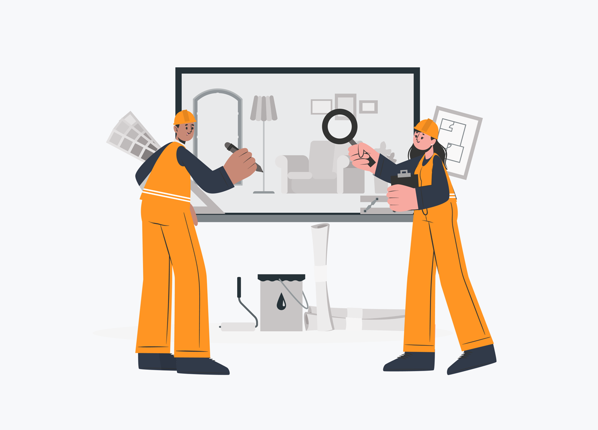
Our Top 11 Picks For The Best Home Improvement Websites [Steal Their High-Converting Features]

Get inspired to create your own home improvement website based on lessons learned from some of the best trades service sites on the internet. Seriously, steal these high-converting features to grow your business.
As a home improvement business owner you know how to turn a run-down room into the beating heart of a home, but are you making sure your website is at the top of its game too?
When it comes to websites, the sky’s the limit.
But just because you *can* make everything neon green, add 86 pages, and post selfies on your ‘About Us’ page doesn’t mean you should.
So, what goes into making a professional home improvement website?
We’re going to break this topic down for you, but to sum it up in two words – User Experience (UX).
Why does user experience matter?
Potential customers need to be able to find your site, form a great first impression, locate the info they need, and take action. In a perfect world, that action will tie into your business goals, whether it’s quote requests, sales and so on.
If you don’t have a website, now’s the time to capitalize on the growing home improvement market and get in front of new customers. 60% of consumers expect companies to have a website, and 46% of all Google searches are for local businesses. Combine these two concepts, and it quickly becomes clear that having no website equals a big miss for any business.
For home improvement contractors or companies this is even more pronounced. Let’s be honest, your customers have options: every local industry offers homeowners more than one plumber or electrician to choose from.
As customers search for the best fit, having a professional website can help you be found.
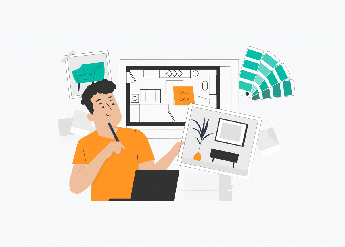
In short, you’ll want to put together a site that supports your goals and your brand. While you’ll want to be unique, sourcing some inspiration from top websites can be a great place to start. Let’s take a closer look at some of the top picks for home improvement website design to get your creativity flowing.
Best practices for home improvement website design
Design is about creativity, but website design incorporates a bit of science behind the scenes.
The placement, colors, layout, and every inclusion can be optimized by knowing how to combine elements that look great while playing to your customer’s behavior patterns.
Home improvement is a diverse industry. The needs of construction, landscaping, roofing, and every other trade can widely vary. But the best practices of web design are applicable to every home improvement business.
And since we love lists, we’ve put together a practical checklist featuring design considerations you’ll want to keep in mind for your own site design. Plus, we’ll be taking this along with us to walk you through the wins for our top 11 list.
Nobody wants to waste time trying to find something on your site. Your website needs to have clear and easy navigation so visitors can quickly locate pages or information they want.
Page content should never be buried. For example, your main menus should only have 2 layers of hierarchy or pages to dive into. If not, your site could fall victim just like the 69% of web content that goes unseen.
Mobile friendly
People have broken the ties to their desktop computers for a while now, and the numbers are trending more toward mobile experiences. Smartphones accounted for over 50% of web traffic in early 2021.
What’s more, 50% of mobile searches are local users looking for local businesses.
This is why you need a responsive website. This means that your website loads properly and looks great no matter where it’s viewed. The content simply adjusts to different screen shapes and sizes which is vital because users expect sites to work wherever they view them.
Consistent branding
Your website represents your business, with more potential reach than any physical local marketing you’re carrying out. You’ll want to design a site that pulls in the branding elements from your existing company. Incorporate your logo, keep your company name consistent, and carry your corporate colors from top to bottom.
Scannable content
After all of the work you put into creating content, you might not want to hear that readers spend roughly 2 minutes on a website. This doesn’t mean they didn’t see what you have to offer. The trick is in how they see it.
Readers scan web pages, typically reading 20% of words on the page. They’re in a hurry, looking for something specific, or perhaps a bit lazy.
Still, most people browse with intent. They want to check out your site, find what they were looking for, and then either leave or act. A great home improvement website will make it easy for site visitors to scan headers and small paragraphs for what they want and make it easy for them to take action then and there.
Obvious actions
What is the ultimate goal for your website?
Is it to generate leads? Create awareness about your business locally? Generate email sign ups?
Lots of questions, we know. But it is entirely worth considering these questions before starting out. Decide what you want the outcome to be, and then make THAT the easiest thing to do from anywhere on the page. The most effective websites present clear answers and help visitors take that next step.
Engaging images
We already know most visitors aren’t actually reading all of your copy. So what else are they looking at?
Turns out it’s pictures.
If a website isn’t engaging or attractive, 38% of visitors will move on.
To take advantage of these customer browsing trends, you’ll want to include images that are relevant to your industry and the services you provide. Showing of specific projects, details, and equipment can engage visitors. Even if you pull in a few stock photos, make sure they relate to what you do.
Keen to download FREE high-quality photos? Here’s our advice on how to find free website images
Fast load times
Fast but not least (see what we did there?) is load time.
If a website takes more than 2 seconds to load, people will leave. Whether your design is optimized for mobile or has too many high-resolution pictures can directly affect your load speed.
If you’re concerned your home improvement site is on the slow side, use Google’s Free PageSpeed Insights tool for a full site speed audit with bonus optimization tips.
11 of the best home improvement website designs
Ready to be inspired?
We put our checklist to work and curated the top home improvement websites for you to explore. You can use the highlighted examples below when brainstorming the look, feel, and function of your own website. Be sure to take note of the few misses we mention along the way as examples of what to watch for as you move forward.
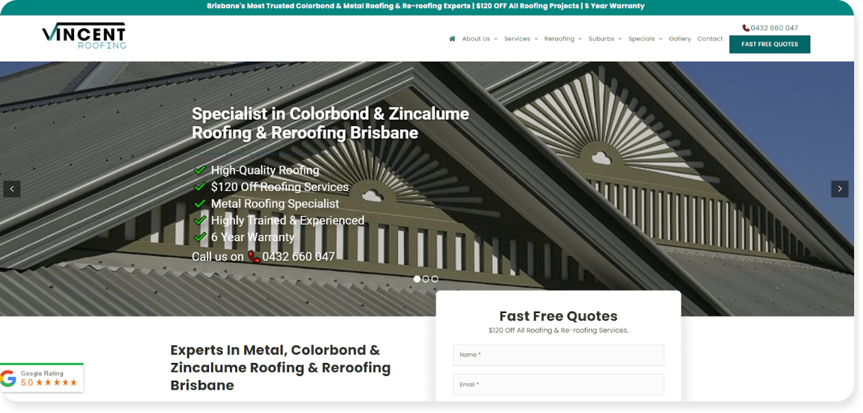
#1 – Vincent Roofing
Why we love it
It’s 100% clear from the start what Vincent Roofing does and why they’re the best at what they do.
Not only can visitors see three top services in the image slider, they’re backed with a visual checklist that shows exactly why customers should call them.
This site was crafted by our team at Tradie Digital, with SEO-optimized content helping drive regular clicks and leads through Google. Roofing and location keywords appear strategically throughout headings and regular text, making Google and potential customers happy.
Best practice checklist
| Best Practice | Hits and Misses | |
|---|---|---|
| ✔ | Navigation | Clear and easy even with lots of services pages |
| ✔ | Responsiveness | Looks great on screens of all sizes |
| ✔ | Branding | Logo colors are carried through from graphics to buttons |
| ✔ | Scannable | Page content mixes bullet lists and short sections with lots of section headers to break things up |
| ✔ | Call to Action | The message is clear: fast and free quotes are up for grabs. And you can request one throughout each page |
| ✔ | Graphics | Images mix roofing styles, materials, and applications but always show relevant projects |
| ✔ | Load Time | Page content populates fast including slider images |
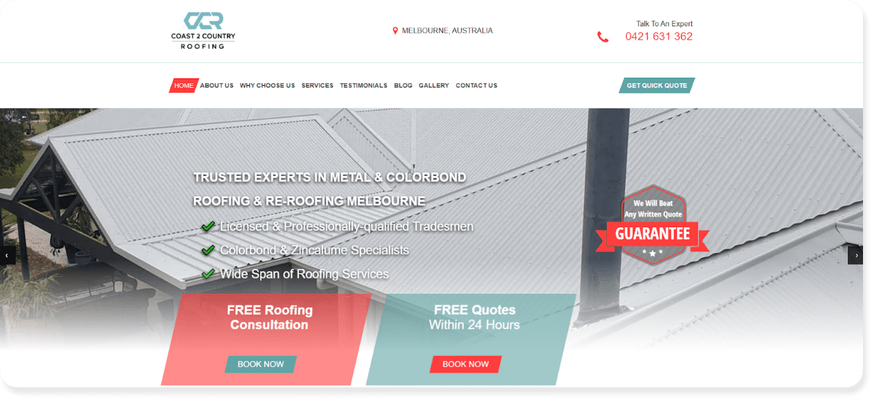
Why we love it
This website is extremely easy to read or scan as you make your way down the homepage. If a customer is looking for a specific service, they are sure to find it. In fact, the Services dropdown in the navigation makes it even quicker to find a subset of a service just right for the homeowner.
Clearly oriented toward roofing needs of all sorts, the theme is carried through using the Pedestal website builder and layouts. With this, you can scan all of the way through to see exactly what stands out.
Best practice checklist
| Best Practice | Our Verdict | |
|---|---|---|
| ✔ | Navigation | Simple and broken down based on areas of interest to the reader |
| ✔ | Responsiveness | Looks great on screens of all sizes |
| ✔ | Branding | Logo colors are carried through from graphics to buttons |
| ✔ | Scannable | Great use of lists and bold text to make key items pop visually |
| ✔ | Call to Action | Multiple value offers as visitors can book a consultation or get a quote to make it easy to learn more |
| ✔ | Graphics | Photos mix broader stock images of materials with actual completed projects |
| ✔ | Load Time | Page content populates fast – even the photo gallery |
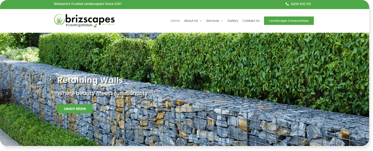
#3 – Brizscapes
Why we love it
You know instantly which facets of landscaping Brizscapes focuses on.
You don’t even have to scroll to know that design, installs, and beauty are tops for this business, which the above the fold real estate put to striking use. The high-end custom design (also by Tradie Digital) is positioned to attract high end clients, showcasing the need to design a home improvement site to target your ideal customers.
Best practice checklist
| Best Practice | Our Verdict | |
|---|---|---|
| ✔ | Navigation | Streamlined to direct people to what matters most: general info, services, or images |
| ✔ | Responsiveness | Looks great on screens of all sizes |
| ✔ | Branding | Logo colors are carried through from graphics to buttons |
| ✔ | Scannable | Content appears in horizontal sections that transition topics and make it easy to navigate |
| ✔ | Call to Action | Different options available to learn more about the company and services, but the Landscape Consultation option is fixed at the top |
| ✔ | Graphics | Amazing blend of hardscape and landscape images, all tied into the high-end aesthetic and incorporating their brand green color |
| ✔ | Load Time | Page content populates fast including project portfolios |
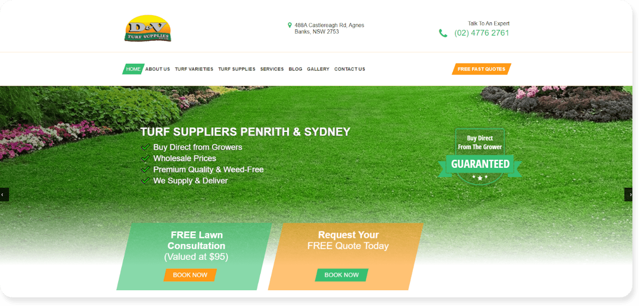
#4 – D&V Turf Supplies
Why we love it
This site does an excellent job at breaking down content between turf varieties, supplies, and services.
Home improvement businesses can use this as an example of how to segment their own product vs service offerings. Created using the Pedestal website builder, D&V Turf Supplies also made the template their own with color coordination and custom pages.
Best practice checklist
| Best Practice | Our Verdict | |
|---|---|---|
| ✔ | Navigation | Great use of extra headings to break out offerings |
| ✔ | Responsiveness | Looks great on screens of all sizes |
| ✔ | Branding | Logo colors are carried through from graphics to buttons |
| ✔ | Scannable | While the copy is lengthy, shorter paragraphs and bold text make it easier to skip over to what you’re looking for. |
| ✔ | Call to Action | Visitors can easily book a consultation or quote from any page on the website. |
| ✔ | Graphics | Combining stock lawncare graphics with more specific turf closeups makes this look and feel custom. |
| Load Time | Page text loads fast but gallery images take longer to load. We recommend grouping pictures in separate galleries to cut down on load time. |
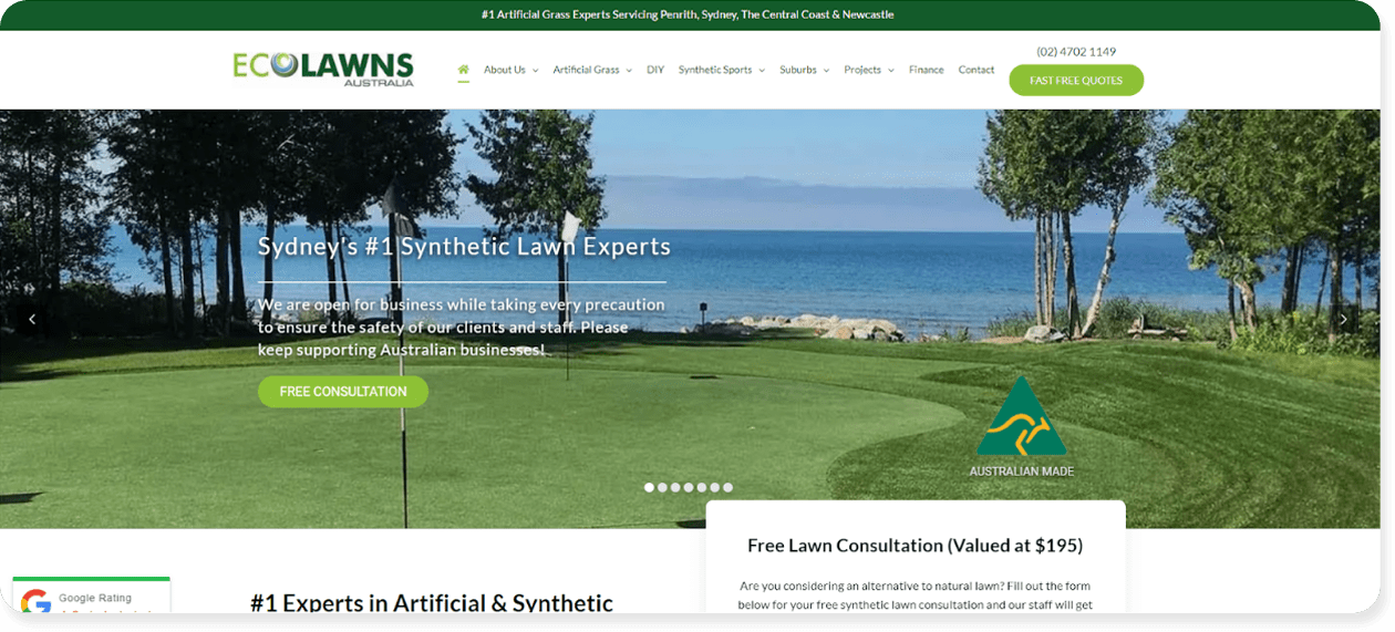
#5 – Ecolawns Australia
Why we love it
What do you do if your business caters to both residential and commercial customers? You group your website content by the groups of people searching.
Ecolawns has sections dedicated to a number of different customer targets. Creatively, they are easy to navigate and customers can ignore the content that’s irrelevant to them.
Best practice checklist
| Best Practice | Our Verdict | |
|---|---|---|
| ✔ | Navigation | Super easy to find what you are looking for no matter what kind of customer is browsing. |
| ✔ | Responsiveness | Try it on your phone and see how the menu changes without losing the navigation layers. |
| ✔ | Branding | All colors are carried through page elements with pops of color to break up all of the green |
| ✔ | Scannable | Easy-to-read sections and FAQ content as an example of easily scannable content |
| ✔ | Call to Action | It’s clear that consultations and quotes are no cost, which can help them stand out from competitors |
| ✔ | Graphics | Every image specifically ties back to the copy it goes with, telling a detailed story with visuals |
| Load Time | Page content loads quickly but take note of the Project Galleries, great examples of before and after but slower to load with so many pictures |
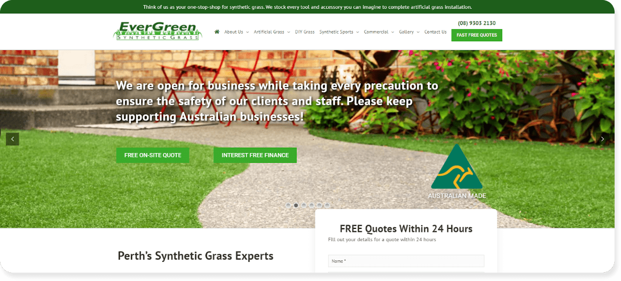
Why we love it
A different take on an artificial turf website (compared to Eco Lawns above), but a striking example of how two similar companies can differentiate themselves in the market.
Every section is concise, clear, and shows exactly what these home improvement companies do best, with less writing and more showing. We think the stats on the home pages are a fantastic way to show credibility, and they’re logically followed by a great list of bullet points.
Best practice checklist
| Best Practice | Our Verdict | |
|---|---|---|
| ✔ | Navigation | Separates general information from services as well as different audience content |
| ✔ | Responsiveness | Looks great on screens of all sizes – notice how content stacks on smaller screens |
| ✔ | Branding | Logo colors are carried through from graphics to buttons |
| ✔ | Scannable | Excellent example of using sections, short text, and bullets to let readers scan for what they want to know |
| Call to Action | While it’s easy to take action, there are quite a few different offers (quotes, learn more, financing). We recommend narrowing this down a bit to give customers fewer options | |
| ✔ | Graphics | Great use of pictures and custom icons to help readers understand offerings with less actual reading |
| ✔ | Load Time | Page content populates fast – even the photo gallery which can slow websites down |
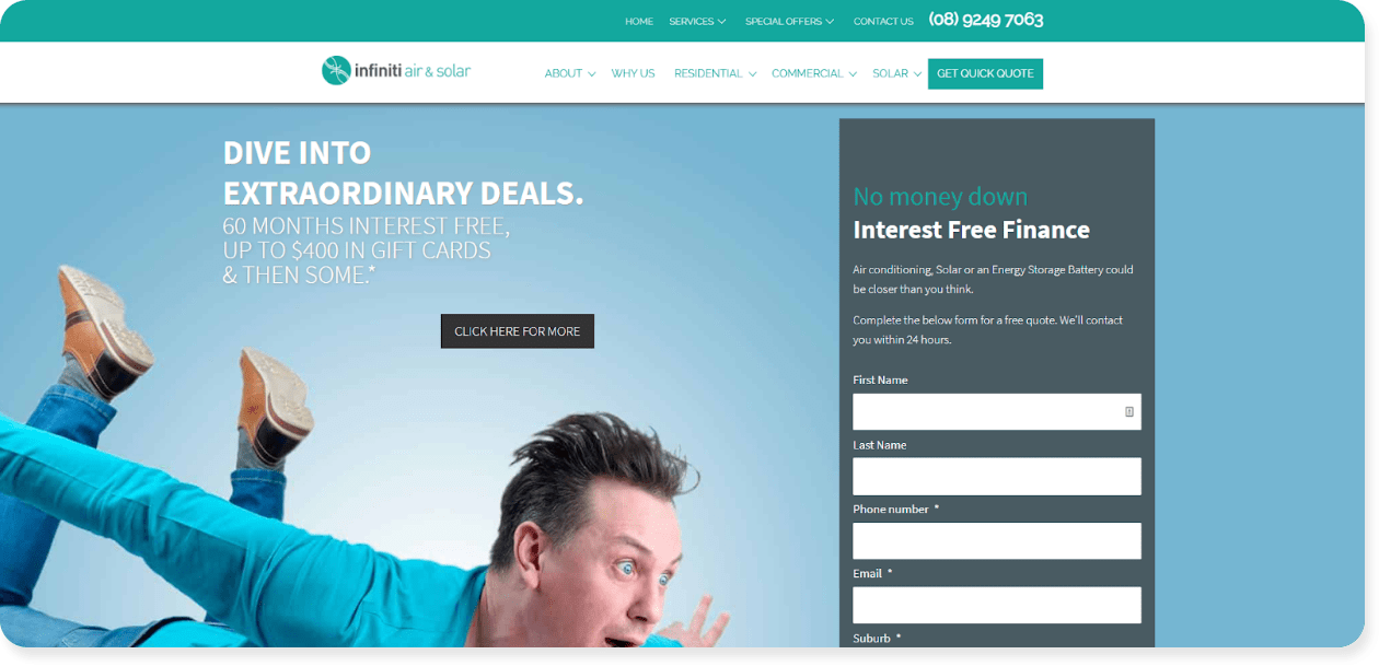
#7 – Infiniti Air & Solar
Why we love it
Talk about eye catching.
This home improvement site starts out with graphics that tie into air and solar without the traditional shots of panels on a roof. Visitors are drawn in to learn more, and the rest of the content is easy to both understand and relate to.
Check out their use of a free downloadable report to show off their expertise and generate leads.
Best practice checklist
| Best Practice | Our Verdict | |
|---|---|---|
| ✔ | Navigation | It takes about 2 seconds to sort through available pages and find what you’re looking for. |
| ✔ | Responsiveness | Looks great on screens of all sizes |
| Branding | Their logo color is pulled through all page elements, but a bit of contrast or another complimentary color could help break things up visually | |
| ✔ | Scannable | Very quick to scan through content with short paragraphs and headers. More color contrast might help the different sections stand out from each other |
| ✔ | Call to Action | Almost all roads lead to the free quote – the next best step for any new client |
| ✔ | Graphics | Great balance of fun and engaging media with more service and equipment-focused images where relevant |
| ✔ | Load Time | Page content loads quickly – even the free report download |
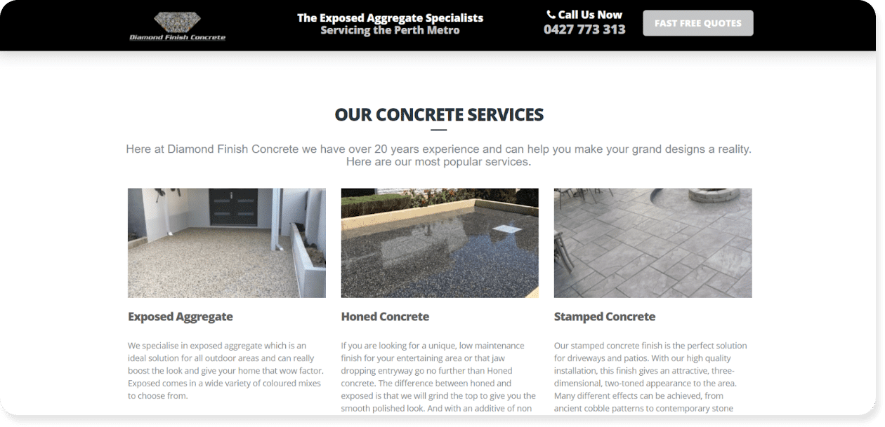
Why we love it
This website makes concrete look stunning.
Every available service is shown off with amazing finished project shots that give customers confidence that their project can look just as amazing. They also walk readers through the differences in services in just a few sentences, making it quick to decide to move forward.
Best practice checklist
| Best Practice | Our Verdict | |
|---|---|---|
| Navigation | There isn’t a navigation bar on this site. While the content is sparse enough that separate pages aren’t necessarily needed, customers might expect to see a few pages and more detail | |
| ✔ | Responsiveness | Looks great on screens of all sizes, but watch how long it takes to scroll on a phone when all of the content is on a single page |
| ✔ | Branding | Logo colors and fonts are consistent but pops of color would have livened up the black and white color scheme |
| ✔ | Scannable | Content is very easy to scroll through until you find the right content for your needs |
| ✔ | Call to Action | There is one action for all readers: get a free quote. They added buttons throughout the page to make it easy to act from anywhere |
| ✔ | Graphics | Not only does the concrete look great, they show their projects off with a great mix of wide shots and closeups |
| Load Time | With everything on a single page, content toward the bottom takes a bit longer to load |
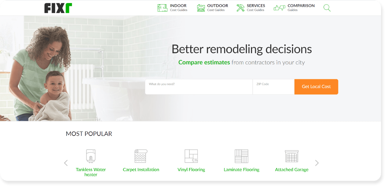
#9 – Fixr
Why we love it
This site is the pinnacle of scannable content.
While spanning quite a few home improvement industries, the website makes it incredibly easy to either search for a service or scroll through to find what you need based on topic.
Best practice checklist
| Best Practice | Our Verdict | |
|---|---|---|
| Navigation | While you can scroll through to find your home improvement topic, there’s no main navigation to give you a shortcut to what you want | |
| ✔ | Responsiveness | Looks great on screens of all sizes. In fact, smaller screens streamline content to work similar to a navigation listing |
| ✔ | Branding | All colors are carried through page elements with a lot of whitespace to spread out content |
| ✔ | Scannable | This site is all about quickly finding what you need. The scanning works on multiple page levels until you drill down to what you are looking for |
| Call to Action | With so many offerings, it’s hard to provide a clear action other than searching more directly for what you are looking for | |
| Graphics | Icons make it easy to find the subtopic you want, but the lack of pictures makes the pages very text heavy. Notice how the few stock photos look out of place | |
| ✔ | Load Time | Page content loads quickly |
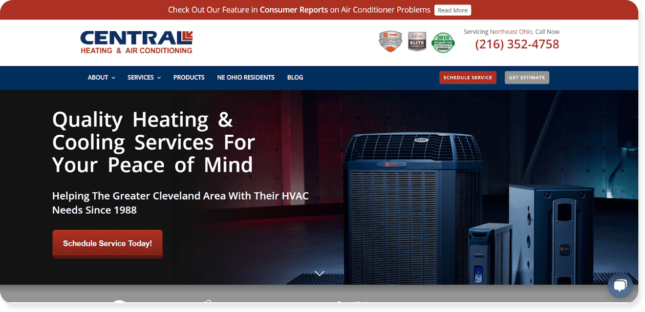
#10 – Central HTG
Why we love it
If you’re looking for a heating and air conditioning service, you probably know how important it is to find a trusted, quality team.
This website is a great example of how to lead with your strong points and quiet the competition by improving your own expertise. Visitors immediately see a number of trust statements including experience, certifications, and warranties that instill confidence.
Best practice checklist
| Best Practice | Our Verdict | |
|---|---|---|
| ✔ | Navigation | Excellent for going from service, to type, to specific need in a matter of seconds |
| ✔ | Responsiveness | Looks great on screens of all sizes |
| ✔ | Branding | Logo colors are pulled through everything from buttons to icons to click to dial links |
| ✔ | Scannable | Great use of headers and different section designs (bullet lists, boxes, color shading) help content stand out |
| ✔ | Call to Action | The main actions stay anchored at the top of the page no matter where you are on the website |
| ✔ | Graphics | Use of images is a little underwhelming but every graphic is relevant and helpful to the content it goes with |
| ✔ | Load Time | Page content loads almost instantly |
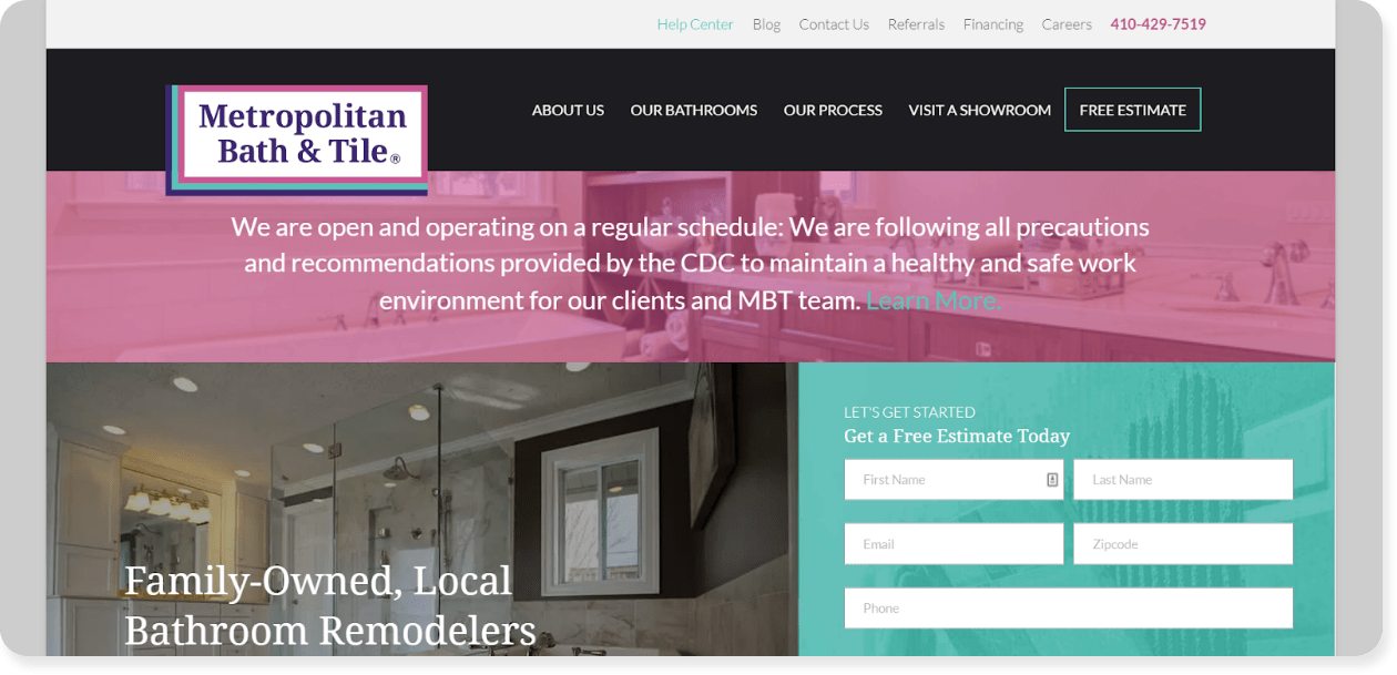
#11 – Metropolitan Bath & Tile
Why we love it
This website answers nearly every question a customer could have without having to leave the homepage.
This design approach shows that you can include service and company details without overwhelming visitors. There’s even a tabbed section that lets readers explore the key things the company offers including guarantees and showrooms.
Best practice checklist
| Best Practice | Our Verdict | |
|---|---|---|
| ✔ | Navigation | Two levels of navigation separate core reasons for site search from secondary items like blogs and job openings |
| Responsiveness | While this site works on all screen sizes, look at how the different sections and tabs change and are more clunky to use on mobile | |
| ✔ | Branding | A+ for carrying some rather vibrant brand colors throughout the entire website |
| Scannable | Content is broken into short sections but take note of how the lighter font colors make it a little harder to read quickly | |
| ✔ | Call to Action | Streamlined pages provide information to help customers decide to take the step for an estimate |
| ✔ | Graphics | This site doubles as a virtual showroom and shows off a great variety of finishing, layouts, and fixtures to engage customers |
| ✔ | Load Time | Even with so many images, all pages load quickly |
Time to put what you’ve learned into a home improvement website of your own
We could go on and on when it comes to critiquing home improvement website design (and we often do), but we encourage you to look up the sites of a few services you have used (or even a competitor or two) and put them to the test with our best practice checklist.
What strong points do you find and how do you define your competition’s hits and misses?
The goal of this exercise is to take the most effective website design approaches and apply them to your own home improvement website.
Design leaves a lot of room for creativity, and in the end there’s no one size fits all way to create a perfect website.
Keep in mind, websites are just one factor in your home improvement business marketing strategy.
Ready to take your home improvement website and start driving high-quality (and high-paying) leads? Click here to learn more about our lead generation and marketing services.
